Affinity Diagram Template
A root cause technique that drills from a problem to its underlying cause by asking Why five times.

What is a Affinity Diagram Template?
An Affinity Diagram Template provides a structured framework for grouping large volumes of qualitative data (ideas, observations, complaints, requirements) into meaningful themes through a team-based sorting process.
When to use a Affinity Diagram Template
Use it in the Define phase to organise Voice of the Customer data, and in the Analyse phase to group brainstormed root causes or improvement ideas before deeper analysis.
Who should use a Affinity Diagram Template
- Green Belts and Black Belts — organising Voice of the Customer data and brainstormed root causes in the Define and Analyse phases
- Facilitators — structuring large volumes of qualitative data from workshops, surveys and interviews
- Product and service designers — grouping customer requirements and feedback into actionable themes
- Research and insight teams — making sense of large, unstructured qualitative datasets from interviews or focus groups
How to use a Affinity Diagram — step by step
-
1Write the problem statement at the top
Start with a clear, factual problem statement. 'Machine stopped' or 'Customer received wrong item' — specific, observable, factual. Vague problems produce vague root causes.
-
2Ask 'Why did this happen?' — Why 1
Write down the first-level cause. This is usually a symptom or a direct cause — not yet the root. Examples: 'Machine overheated', 'Wrong item was picked'.
-
3Ask 'Why did that happen?' — Why 2
Challenge the previous answer. Keep the team focused on causes, not blame. If the answer is 'human error', push further — why did the human make the error?
-
4Continue to Why 3, 4 and 5
Keep going until you reach a cause that is systemic — a missing process, a failed control, a gap in training or a design flaw. The number five is a guide, not a rule.
-
5Check the logic by reading upward
Read the chain back to front: 'Because of X, Y happened, which caused Z.' If the logic holds, you have a valid chain. If it breaks, revisit the step where it breaks.
-
6Identify the actionable root cause
The root cause is the deepest level where a corrective action can prevent recurrence. Document it clearly — this feeds your Improve phase solution design.
-
7Validate before acting
Do not jump to solution immediately. Check whether data or observation confirms the root cause is real and significant before committing resource to fixing it.
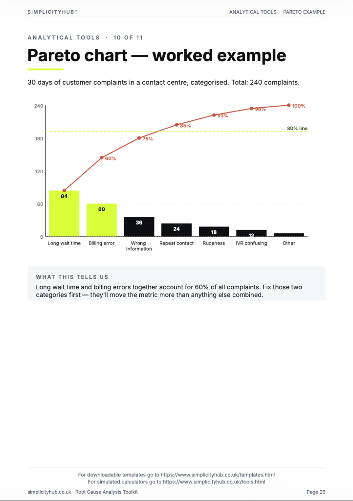
Worked example — Organising Customer Complaint Data
A customer experience team processed 156 complaint records using an Affinity Diagram in a 90-minute session — grouping them into 7 themes. The largest theme (communication failures, 42 complaints) immediately became the project focus.
Common mistakes — and how to avoid them
Sorting in the wrong order. Always sort in silence first, then discuss. Verbal discussion during sorting anchors the group around the first speaker's categories.
Forcing every item into a group. Some items genuinely don't fit. Don't distort your themes by forcing outliers into categories where they don't belong — keep an 'Other' holding area.
Writing vague header cards. A header card that says 'Process Issues' is too broad to be actionable. The best header cards are specific enough to suggest what action is needed.
Stopping at one level of grouping. After initial grouping, look for meta-themes. Finding 3–5 high-level themes from 15–20 sub-groups makes the insights more strategic and actionable.
Tips for getting better results
Use physical sticky notes if possible. Physical sticky notes enable tactile sorting and movement that is harder to replicate digitally. Remote teams can use Miro or Mural as an alternative.
Photograph the completed diagram immediately. Sticky note sessions can fall off walls or be disturbed. Photograph the final arrangement before anyone leaves the room.
Count items per theme. The theme with the most items is usually the highest priority. Volume of data points to where the most widespread issues lie.
Advanced Toolkit Packs — available now
Structured, ready-to-use template packs designed for real improvement work. Pick the pack that matches your project and get started straight away.
Process Improvement Starter Pack
A starter pack for identifying improvement opportunities, measuring baselines and planning action.
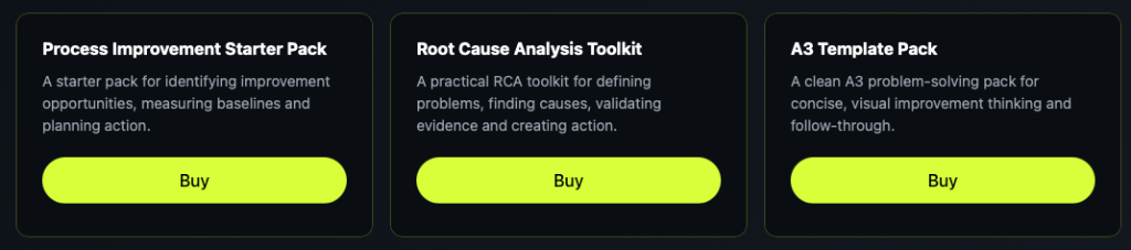
Root Cause Analysis Toolkit
A practical RCA toolkit for defining problems, finding causes, validating evidence and creating action.
A3 Template Pack
A clean A3 problem-solving pack for concise, visual improvement thinking and follow-through.