Straight-talking guides on Lean, Six Sigma, DMAIC and the tools that actually get used on the shop floor — not just in the classroom.
Every article is written to be used, not just read.
Any statistic or figure is cited at the bottom of the article.
Most articles link straight to a free template or calculator.
Two classic improvement cycles, compared head-to-head so you can pick the right one for your project.
A realistic starting point for SMEs who don't have a dedicated quality department.
Stop guessing whether a process shift is real or just noise.
The most common ways CI programmes quietly die — and how to catch them early.
A clear map of the major frameworks so you can pick a philosophy, not just a toolkit.
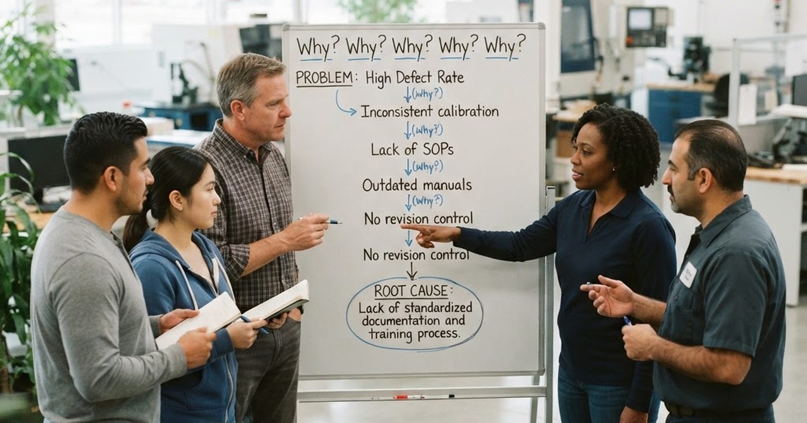
A deep, practical walkthrough of root cause analysis and the 5 Whys technique, with worked examples.
What certified Green Belts actually earn in 2026, and what it takes to get there.
Actionable Lean tools you can start using today, with free templates for each.
A plain-English guide to process capability, with the formulas and what the numbers actually mean.
An advanced but underused tool for turning customer voice directly into design requirements.
By The SimplicityHub Team
If you've spent any time around process improvement, you've bumped into both acronyms: DMAIC and PDCA. They look similar at first glance — both are cyclical, both are structured, both are meant to stop people "fixing" problems based on gut feel. But they were built for different jobs, and picking the wrong one is one of the quieter reasons improvement projects stall.
PDCA (Plan-Do-Check-Act) traces back to Walter Shewhart's work on statistical process control in the 1920s and 30s, and was popularised by W. Edwards Deming as a management philosophy for continuous, incremental improvement[1]. It's deliberately lightweight: Plan a change, Do it on a small scale, Check whether it worked, then Act — either standardise the change or go round again. It's a loop, not a project. You can run a PDCA cycle in an afternoon.
DMAIC (Define-Measure-Analyse-Improve-Control) is the backbone of Six Sigma, formalised at Motorola in the 1980s as a more rigorous, data-heavy structure for tackling problems with unclear root causes[2]. It adds two things PDCA doesn't force you to do: a dedicated Measure phase (baseline the problem with real data before touching anything) and a dedicated Analyse phase (statistically test which factors actually drive the defect, rather than guessing). Control, the final phase, is about locking the gain in with monitoring systems — control charts, SOPs, audits — so the improvement doesn't quietly reverse.
The honest way to choose is to ask two questions:
A useful rule of thumb: PDCA for continuous, small-scale, front-line improvement (kaizen-style); DMAIC for defined projects with a business case, a named owner, and a measurable financial or quality target.
In practice, mature improvement cultures run both at once. Six Sigma's Control phase is itself a standing PDCA loop — once a process is stable, you keep monitoring it with small Plan-Do-Check-Act adjustments rather than launching a new DMAIC project every time a control chart wobbles. Think of PDCA as the daily driving and DMAIC as the engine rebuild.
If you're not sure which one your current problem needs, our What is DMAIC guide breaks down each phase in more detail, and our free DMAIC templates give you the Measure and Analyse worksheets ready to use on your next project.
By The SimplicityHub Team
Most Lean Six Sigma content is written for people who already have a quality department, a data analyst on call, and a green light to shut down a line for a week of study. If you run or manage a small manufacturing operation, none of that is true — and most of the advice quietly assumes it is. Here's a version that doesn't.
Small manufacturers fail at Lean Six Sigma most often by trying to roll it out everywhere at once. Pick the single line or cell causing the most pain — usually the one with the worst scrap rate, the most customer complaints, or the longest changeover time — and run your first project there only. A visible win on one line builds the internal case for the next one.
You don't need Minitab or a six-week course to start. A whiteboard 5-Why, a simple check sheet, and a Pareto chart of your top 5 defect types will get you 80% of the value most SMEs need in their first project. Save formal statistical process control for once you have a rhythm going.
Small manufacturers often assume they need new sensors or software before they can "do Lean Six Sigma." In reality, most shop floors already generate the data you need — scrap logs, changeover timesheets, customer returns — it's just scattered. A simple daily check sheet, filled in by hand for two weeks, is usually enough to baseline a problem properly.
For smaller operations, the biggest wins are frequently about flow, not defects: reducing changeover time, cutting work-in-progress, rearranging a cell so operators aren't walking back and forth. A basic 5S audit and a value stream map often surface more savings, faster, than a statistical deep-dive into defect causes.
The single most common failure mode in small manufacturing improvement is the "great week, then it drifts back" pattern. Whatever you change, write it down as a one-page standard, post it at the workstation, and check it weekly for the first month. This is the Control phase of DMAIC, just scaled down to fit a five-person team instead of a five-hundred-person plant.
If this is genuinely your first structured improvement project, our White Belt course is built specifically for exactly this starting point — no statistics background assumed. Pair it with our free templates library for the check sheets, Pareto trackers and 5S audit sheets mentioned above.
By The SimplicityHub Team
A control chart answers one question, and it's a more important question than most people realise: is this variation something I should react to, or is it just normal noise? Getting that wrong in either direction is expensive — either you chase phantom problems that were never real, or you ignore a genuine shift until it becomes a customer complaint.
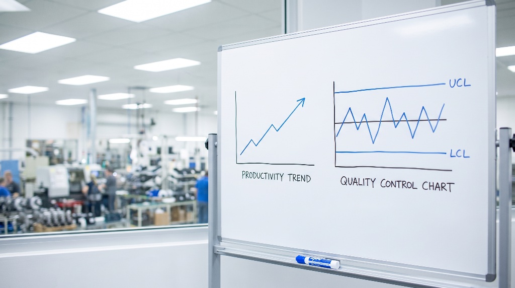
Every process has natural variation — Walter Shewhart called this "common cause" variation, and it's expected and stable[1]. A control chart plots your data over time against statistically calculated upper and lower control limits (typically ±3 standard deviations from the process mean). When a point falls outside those limits, or a run of points shows a non-random pattern, that's "special cause" variation — something changed, and it's worth investigating. The chart's entire job is to stop you overreacting to normal noise while still catching real shifts quickly.
Use an I-Chart when you're measuring one continuous value per unit or per time period — a temperature reading, a cycle time, a fill weight — and you can't or don't want to group measurements into subgroups. It's the simplest control chart to set up and read, which makes it a good default for low-volume or slow processes where you only get one data point per batch.
Use a P-Chart when you're tracking a proportion or percentage defective within a sample — for example, "12 defective units out of a 200-unit sample." Unlike the I-Chart, the P-Chart's control limits actually widen or narrow depending on your sample size, because a defect rate calculated from a small sample is naturally noisier than one from a large sample. This is the chart to reach for whenever your data is pass/fail or good/bad rather than a continuous measurement.
Beyond a single point outside the control limits, watch for: seven or more consecutive points on one side of the centre line (a sustained shift), a clear upward or downward trend across six or more points (drift), and unusually low variation that hugs the centre line tightly (which can indicate the process has genuinely improved — or that the measurement system itself has stopped detecting real variation).
Building your first control chart is far easier with the right inputs already calculated. Our free control limits & SPC calculator will work out your control limits automatically from your own data, so you can start monitoring in minutes rather than working the formulas by hand.
By The SimplicityHub Team
Most continuous improvement programmes don't die in a dramatic failure. They fade — the weekly huddle gets skipped, the tracker stops being updated, the champion moves to another project, and six months later nobody can quite explain what happened to "that Lean thing we were doing." Here are the five patterns behind that fade, and the practical fix for each.
Teams pour effort into Define, Measure, Analyse and Improve, then treat Control as an afterthought — a control chart nobody checks, a SOP nobody re-reads. Without a named owner and a scheduled review cadence, gains erode within weeks. Fix: assign a specific person and a specific recurring check-in (weekly for the first month, then monthly) before you consider the project closed.
"Improve customer satisfaction" or "reduce waste" isn't a project, it's a mission statement. Vague problem statements lead to vague data collection, which leads to a team arguing about opinions instead of testing causes. Fix: a good problem statement names the specific metric, the specific gap, and the specific timeframe — e.g. "Late deliveries on the Tuesday route have risen from 4% to 17% since March."
It's common for a CI initiative to get a strong kickoff — a launch meeting, a banner, a mention in the all-hands — and then silence from leadership once the initial excitement fades. Teams read that silence correctly: this isn't actually a priority. Fix: leadership needs to ask about the project's metrics in normal operational reviews, not just at the launch, so the signal that it matters doesn't disappear after week one.
Skipping a pilot and rolling a change out to the whole operation at once is a common shortcut under time pressure — and it's how unintended side effects get discovered at full scale instead of in a controlled trial. Fix: even a short pilot (one shift, one line, one week) surfaces problems while they're still cheap to fix.
If the only people who know a CI project happened are the ones who ran it, it dies with the next reorg. Projects that survive are the ones tied to a number leadership already cares about — cost, throughput, on-time delivery, complaint rate — and reported back in those terms. Fix: translate the improvement into the language of the P&L or the KPI dashboard the business already watches, not just process-improvement jargon.
Each of these comes back to the same root cause: treating DMAIC as a one-off event instead of an operating discipline. The Define, Measure and Analyse phases get the attention because they're interesting; Control gets skipped because it's less exciting and looks like admin. It isn't — it's the phase that decides whether everything before it was worth doing.
Our free DMAIC templates include a proper Control Plan and Sustainability Plan template, built specifically to stop projects fading once the initial win is banked. If you want a structured path through all five phases with an instructor rather than working it out from scratch, take a look at our Academy courses.
By The SimplicityHub Team
"Operational excellence" gets used as a catch-all term, but it isn't one framework — it's an umbrella over several distinct philosophies that developed separately, for different reasons, in different industries. Understanding where each one came from makes it much easier to see which parts actually apply to your organisation.
Lean traces its roots to the Toyota Production System, developed in Japan from the 1950s onward, built around eliminating waste (muda) in all its forms — overproduction, waiting, defects, excess motion, and more. Lean's central obsession is flow: getting value to the customer with as few interruptions, handoffs and delays as possible. It's less about statistics and more about how work physically or procedurally moves.
Six Sigma was developed at Motorola in 1986 by engineer Bill Smith, aiming to reduce process variation to the point where defects become statistically rare — the "six sigma" target is 3.4 defects per million opportunities. Where Lean asks "how do we remove waste," Six Sigma asks "how do we reduce variation," using DMAIC as its structured problem-solving method. It's more statistically rigorous than Lean, and better suited to problems where the root cause genuinely isn't obvious.
Lean Six Sigma, the combined approach most organisations now use, merges Lean's focus on flow and waste with Six Sigma's statistical rigour and DMAIC structure. In practice this is the most commonly taught version today, because most real operational problems have both a flow component and a variation component.
TQM predates both of the above in its modern form, developing from the 1950s-80s out of the work of Deming, Juran and Ishikawa, particularly their influence on Japanese manufacturing after WWII. TQM is broader and more cultural than Lean or Six Sigma — it's a management philosophy that quality is everyone's responsibility, not a specific department's, and that customer satisfaction should drive every decision. It gave rise to many of the tools Lean Six Sigma still uses today (fishbone diagrams, Pareto analysis) but is less prescriptive about a specific project methodology.
Developed by Eliyahu Goldratt and popularised through his 1984 book "The Goal," TOC starts from a different premise entirely: any system has one bottleneck constraint limiting its overall throughput, and improving anything other than that constraint doesn't improve the whole system. TOC is particularly useful for organisations that have already done Lean or Six Sigma work broadly and need help identifying exactly where to focus next.
For most operations, the honest answer is "elements of several, applied where they fit" — not a purist commitment to one methodology. A useful starting filter: if your core problem is flow and waiting time, start with Lean tools; if it's inconsistent quality with an unclear cause, start with Six Sigma's DMAIC; if you're not sure where the biggest opportunity even is, TOC's constraint-identification approach can point you at it before you invest heavily in either of the others.
If you want a single, well-structured entry point that blends these ideas practically rather than academically, our Continuous Improvement Fundamentals course is built to do exactly that, and our full course library is in the Academy.
By The SimplicityHub Team
Almost every failed improvement project has the same origin story: someone fixed a symptom instead of a cause. The line got a new gasket, the software team added a retry loop, the warehouse added another checklist step — and a few months later, the same problem was back, sometimes wearing a slightly different disguise. Root cause analysis exists to stop this cycle. It's not a complicated technique, but it's one that's very easy to do badly, which is why so many teams end up "solving" the same problem three times a year.
Root cause analysis (RCA) is the umbrella term for any structured method of tracing a problem back past its visible symptoms to the actual condition, action, or system failure that caused it. The key word is structured — RCA isn't just "thinking harder about why something went wrong," it's a repeatable process that forces a team to keep digging past the first plausible-sounding explanation, which is usually where untrained problem-solving stops.
There are several formal RCA techniques — Fishbone (Ishikawa) diagrams, Fault Tree Analysis, Failure Mode and Effects Analysis (FMEA), Pareto analysis — but the one most people meet first, and the one this guide focuses on, is the 5 Whys.
Every problem has a chain of causes behind it, and most visible problems sit at the very end of that chain — they're symptoms, not causes. A machine jamming, a customer complaint, a late shipment: these are all downstream effects. If you fix at the symptom level, you're treating the last domino, not the one that started the chain falling. The domino you stopped falls over again next time, in a slightly different way, because the actual trigger further up the chain was never addressed.
This matters financially as much as operationally. Recurring problems cost more than one-off ones, because they consume investigation time, rework, and goodwill repeatedly instead of once. A defect that keeps recurring because the true cause was never fixed isn't really "fixed" at all — it's postponed, with interest.
The 5 Whys is credited to Sakichi Toyoda and became a core part of the Toyota Production System's problem-solving culture[1]. The method is disarmingly simple: state the problem, ask "why did this happen?", write down the answer, then ask "why" again about that answer. Repeat roughly five times, though the actual number of iterations is a guideline, not a rule — you stop when you reach a cause that is within your control to fix and that, if fixed, would prevent recurrence.
Vague problem statements produce vague root causes. "Customers are unhappy" isn't a starting point; "14% of orders shipped last week arrived more than two days late" is. Precision at this stage saves an enormous amount of wasted effort later, because it stops the team drifting into discussing a different, related problem halfway through the exercise.
5 Whys works best as a group exercise involving the people who actually do the work connected to the problem, not just managers theorising about it from a spreadsheet. A machine operator, a warehouse picker, or a customer service rep will often surface a "why" that nobody in a management meeting would think to ask.
The most common failure in a 5 Whys session is treating the first or second "why" as the finish line, because it already sounds plausible. Plausible is not the same as true, and true is not the same as root. Keep going until the answer describes something systemic — a missing standard, a training gap, a design flaw, an unclear responsibility — rather than a one-off human error, which is very rarely the actual root cause even when it's the easiest thing to blame.
You know you've gone deep enough when the answer to "why" is something your team has the authority and the means to fix. If the chain leads somewhere genuinely outside your control (e.g. "because steel prices rose globally"), that's useful context but not a stopping point for action — back up one level to the last cause that is within your control.
Before implementing a fix, briefly test whether removing the identified root cause would plausibly have prevented the original problem. This doesn't need to be a formal experiment for small issues, but for anything costly to fix, a short pilot or a check against historical data (does the pattern match other instances of this failure?) avoids acting on a root cause that was only partially correct.
Problem: A customer's order shipped three days later than promised.
Root cause: A manual, once-daily stock verification process that was appropriate at the old order volume has become a bottleneck at the new volume, and orders flagged just after the daily cut-off silently wait almost 24 extra hours.
Notice what this example demonstrates: the "obvious" fix at Why #1 would have been "tell the picking team to prioritise this order" — which would have solved this one late shipment and done nothing for the next hundred orders flagged just after 4pm. The actual fix (moving to a more frequent or triggered stock check, or reassigning volume-based capacity to the process) addresses the systemic issue.
Problem: 8% of units on Line 2 are failing final inspection for a hairline crack near a weld point, up from a historical baseline of 2%.
Root cause: An outdated SOP allows manual, judgement-based adjustment of a weld parameter that should be fixed and calibrated, and the increase in defect rate coincides with newer, less experienced shift leads whose "visual judgement" differs from the original operators'.
Again, notice the layering: a shallow fix ("retrain the current shift leads") would help temporarily but would drift again with the next staff change, because it doesn't address the underlying issue that the process depends on individual judgement at all.
5 Whys works best on problems with a single, traceable cause chain. For problems with genuinely multiple, interacting causes (a defect that only appears when three separate conditions align, for example), a Fishbone diagram organised by category (Machine, Method, Material, Manpower, Measurement, Environment) is usually more effective, because it lets a team explore several branches in parallel rather than forcing one linear path. For safety-critical or highly regulated failures, a more formal Fault Tree Analysis or FMEA may be required to satisfy audit or compliance standards.
Problem: The same "unable to print" ticket has been logged by the finance team 11 times in the last quarter, each time resolved by an IT technician restarting the print spooler.
Root cause: Print server capacity was never included in IT's periodic capacity review process, so a genuine, predictable growth in print volume was only ever detected reactively, one failure at a time, instead of proactively.
This example is worth including because it illustrates a pattern common well outside manufacturing: eleven "fixes" (restarting the spooler) were applied to the same symptom over a quarter, and every one of them was technically correct in the moment and completely ineffective at stopping recurrence, because none of them addressed capacity planning. It also shows that 5 Whys applies just as well to office and IT processes as it does to a factory floor — the discipline of the technique doesn't depend on the industry.
Because these two tools are often taught together, it's worth being explicit about when to reach for which one. 5 Whys assumes a single, mostly linear chain of cause and effect — it works best when your instinct says "there's one thread here, I just need to follow it down." A Fishbone diagram (also called an Ishikawa diagram or cause-and-effect diagram) assumes the opposite: that several categories of cause might be contributing at once — typically grouped as Machine, Method, Material, Manpower, Measurement and Environment (the "6 Ms") — and it's built specifically to let a team brainstorm across all of those categories in parallel before narrowing down.
A practical way to decide: start with a quick 5 Whys. If you find the group genuinely disagreeing about which "why" to write down at any step — some people think it's a training issue, others think it's a machine issue — that disagreement is a signal you actually have a multi-cause problem, and switching to a Fishbone diagram to capture all the candidate causes before testing them will serve you better than forcing a single artificial chain.
Identifying a root cause is only half the job; confirming the fix worked closes the loop. This is where root cause analysis connects back to the broader DMAIC Control phase: after implementing a fix, keep watching the same metric that originally flagged the problem (the late-delivery rate, the weld defect rate, the ticket volume) for long enough to be confident the improvement is real and not a temporary dip. A good rule of thumb is to monitor for at least as long as the historical cycle that produced the original problem — if defects were previously reported monthly, watch for at least two to three months before declaring victory. Teams that skip this step sometimes discover, a quarter later, that they fixed a contributing factor rather than the true root cause, and the problem quietly returns.
A root cause investigation that lives only in a meeting's memory tends to get re-litigated the next time a similar problem appears, because nobody can point to what was actually concluded last time. Writing the 5 Whys chain down — problem statement, each why, the final root cause, and the fix implemented — on a single page takes a few minutes and pays for itself the first time someone asks "didn't we already look into this?" six months later. This is exactly the kind of lightweight documentation that separates a team that solves a problem once from a team that solves it repeatedly, forever.
The single biggest thing that separates a useful 5 Whys session from a wasted half hour is discipline: writing the problem statement down precisely, involving the right people, and genuinely resisting the urge to stop at the first comfortable-sounding answer. Done properly, it takes fifteen to thirty minutes and prevents the same problem from quietly resurfacing every few months.
To make this easier to run consistently, our free 5 Whys template gives you a structured worksheet to fill in live during the session, and our RCA worksheet extends this into a fuller root cause investigation for more complex, multi-cause problems.
By The SimplicityHub Team
A Lean Six Sigma Green Belt certification is one of the more reliable ways to move a career forward in operations, quality, manufacturing or process improvement roles — but the salary figures floating around online vary a lot depending on the source, the country, and the industry. Here's a grounded look at what certified Green Belts are actually earning in 2026, and what the certification is actually testing you on.
Salary data for Green Belts varies noticeably by source and methodology, which is worth knowing before you anchor on a single number. Salary.com's 2026 data places the US national average around $119,700–$119,800 per year[1]. Payscale's dataset, which weights differently, puts the average closer to $95,000 per year[2], while Purdue University's Lean Six Sigma programme cites figures in the $85,000–$103,000 range depending on experience level[3]. In the UK, Simplilearn's research places Green Belt salaries around £42,000 per year[4].
The honest takeaway from this spread: expect a realistic US range of roughly $85,000–$120,000 depending on region, industry and experience, and a UK range around £38,000–£48,000. Certification alone doesn't guarantee the top of that range — industry (manufacturing and healthcare tend to pay at the higher end), seniority, and whether the role has "Green Belt" as a job requirement versus a nice-to-have all move the number substantially.
A Green Belt is expected to lead small-to-medium DMAIC projects independently and support larger Black Belt-led projects as a team member. Core skills tested typically include: the full DMAIC cycle, basic statistical tools (process capability, hypothesis testing fundamentals, control charts), root cause analysis techniques (5 Whys, Fishbone), process mapping, and enough project management discipline to run a defined improvement project from problem statement to control plan.
Compared to a White Belt or Yellow Belt, the step up is real: Green Belt expects you to interpret basic statistical output yourself, not just participate in someone else's project. Compared to Black Belt, the difference is scope and depth of statistics — Black Belts are expected to lead larger, more complex, more statistically demanding projects and often mentor Green Belts.
Given the certification typically takes a few weeks to a few months of part-time study and the salary uplift figures above, most professionals in operations-adjacent roles find it pays for itself quickly, particularly if your employer is willing to fund the course or give time for a real project. If you're deciding between Green Belt and jumping straight to Black Belt, Green Belt is the more common and lower-risk starting point — it's respected on its own, and the project experience you gain sets you up well if you decide to progress further.
Our Green Belt course is built around a real, applied DMAIC project rather than exam cramming, specifically because that's the part employers say they value most.
By The SimplicityHub Team
Lean has a reputation for being a long-term cultural transformation, and in the fullest sense it is — but plenty of individual Lean tools deliver a measurable result within days, not quarters. Here are seven you can start using this week, roughly ordered from easiest to set up to most involved.
Sort, Set in order, Shine, Standardise, Sustain. A basic 5S pass on one workstation or cell — removing anything not needed, giving everything else a fixed location, cleaning, then writing down the standard — routinely cuts search-and-retrieval time noticeably within a single shift. Start with our 5S audit sheet template to score a workstation and track improvement over successive passes.
A simple whiteboard showing today's target, actual output, and the gap between them, updated hourly, makes problems visible the moment they happen instead of at end-of-shift review. This alone often surfaces issues that would otherwise go unnoticed for days.
A Kanban system replaces "make to forecast" with "make to actual consumption" — a card, bin, or signal triggers replenishment only when something is actually used. Even a simple two-bin system (use from one bin while the other is being refilled) reduces excess work-in-progress without needing software.
A value stream map traces one product or service from order to delivery, marking value-adding steps versus waiting/handoff time. Most first-time VSMs are genuinely surprising — it's common to find that value-adding work is a small fraction of total lead time, with the rest sitting in queues and handoffs. Our value stream map template gives you a ready structure to map your first process.
A one-page standard — the current best-known way to do a task, with key steps, timing, and quality checkpoints — is one of the highest-leverage, lowest-cost Lean tools available. Without it, "the way we do it" varies by whoever's on shift, and improvements from one operator never spread to the rest of the team.
Single-Minute Exchange of Die (SMED), developed by Shigeo Shingo, separates changeover steps into those that must be done while the machine is stopped ("internal") and those that can be done while it's still running ("external"). Simply sorting your current changeover checklist into these two categories, without buying anything, often cuts changeover time substantially by moving external steps earlier.
A poka-yoke is a simple mechanical or procedural safeguard that makes a mistake physically difficult or impossible — a jig that only fits the part one way, a checklist field that can't be left blank, a cable that only plugs in the correct way round. These are typically cheap to design and, unlike training, don't rely on someone remembering to be careful.
If you can only pick one this week, start with 5S on your worst-performing workstation — it's the fastest to see a result from, and it usually surfaces problems (missing tools, unclear ownership, awkward layout) that make the other six tools easier to apply afterward. Browse our full free templates library for ready-to-use versions of each tool mentioned here.
By The SimplicityHub Team
Process capability answers a specific, practical question: given the natural variation in your process, how well does it actually fit inside your customer's specification limits? A process can be perfectly "in control" — stable, predictable, no special-cause signals on a control chart — and still produce a meaningful number of defects, simply because its natural spread is too wide for the tolerance it's being asked to hit. Cp and Cpk are the two numbers that quantify this.
Cp compares the width of your specification limits to the width of your process's natural variation, assuming the process is perfectly centred on the target:
Cp = (USL − LSL) / (6 × σ)
where USL and LSL are your upper and lower specification limits, and σ is your process's standard deviation. Cp only tells you whether the spec is wide enough to accommodate the process's variation in principle — it says nothing about whether the process is actually centred where it should be.
Cpk takes centring into account, which is why it's almost always the more useful number in practice:
Cpk = min[ (USL − μ) / (3σ), (μ − LSL) / (3σ) ]
where μ is the process mean. Cpk takes the smaller of the two distances (mean-to-upper-limit and mean-to-lower-limit) because whichever specification limit the process mean is closer to is the one you're at greater risk of breaching.
If your process is perfectly centred, Cp and Cpk are equal. As soon as the mean drifts off-centre toward either limit, Cpk drops below Cp, because the distance to the nearer limit shrinks while Cp keeps assuming perfect centring. A large gap between Cp and Cpk is a specific, useful diagnostic: it tells you the variation itself isn't the problem, the centring is — which usually points toward a calibration, setup, or targeting fix rather than a variation-reduction project.
Suppose a part has a target thickness of 10.0mm, with a specification of 9.7mm to 10.3mm (LSL 9.7, USL 10.3). Sampling shows the process mean sitting at 10.05mm with a standard deviation of 0.08mm.
Cp = (10.3 − 9.7) / (6 × 0.08) = 0.6 / 0.48 = 1.25 — reasonable potential capability.
Cpk = min[ (10.3 − 10.05) / (3 × 0.08), (10.05 − 9.7) / (3 × 0.08) ] = min[1.04, 1.46] = 1.04
This tells a specific story: the process could comfortably achieve a Cpk around 1.25 if it were perfectly centred, but because the mean has drifted 0.05mm above target, actual capability is only 1.04 — a re-centring fix (adjusting the process target back to 10.0mm) would recover meaningful capability without touching the variation at all.
Calculating this by hand from raw sample data is easy to get wrong under time pressure. Our free Cp/Cpk calculator does the arithmetic for you from your own sample data, so you can focus on interpreting the result rather than re-deriving the formulas.
By The SimplicityHub Team
Quality Function Deployment is one of the less commonly used tools in the continuous improvement toolkit — not because it's less valuable, but because it operates earlier and more strategically than most Lean Six Sigma tools, which tend to focus on fixing an existing process rather than designing a new one from customer requirements outward.
QFD was developed in Japan in the late 1960s, most notably at Mitsubishi's Kobe shipyard, as a structured way to translate customer requirements ("voice of the customer") directly into specific technical design characteristics[1]. Its signature output is the "House of Quality" — a matrix that maps customer requirements against engineering characteristics, showing how strongly each design decision affects each customer need, and where design characteristics interact with (help or conflict with) each other.
Without a structured tool like QFD, the translation from customer feedback to design decisions happens informally — in a meeting, based on whoever argues most persuasively, without a documented, traceable link back to an actual customer requirement. QFD forces that link to be explicit: every design decision in the House of Quality traces back to a weighted customer requirement, so priorities are visible and defensible rather than assumed.
QFD is a heavier tool than most of the others on this blog, and it's usually overkill for small, well-understood process tweaks. It earns its cost specifically when: you're designing a genuinely new product or service (not just improving an existing one), customer requirements are complex or conflicting, multiple engineering disciplines need to align on shared priorities, or you need a documented, defensible trail from customer research to design decisions — for example, in regulated industries where design decisions must be traceable back to a documented requirement.
If your problem is "this existing process has a defect," QFD is the wrong tool — that's DMAIC and root cause analysis territory. If your problem is "we're designing something new and need to make sure it actually reflects what customers want, not just what's easy to build," QFD is exactly the right one.
If a full House of Quality feels like too much for your project's scale, a simplified version — just customer requirements, weighted by importance, against your top design decisions, without the full roof/competitor benchmarking — still captures most of the value: a documented, traceable link between what customers actually asked for and what you chose to build.
Our full templates library and Academy courses cover the Define and Measure phase tools, including voice-of-the-customer capture, that feed directly into a QFD exercise like the one described here.