Spaghetti Diagram Template
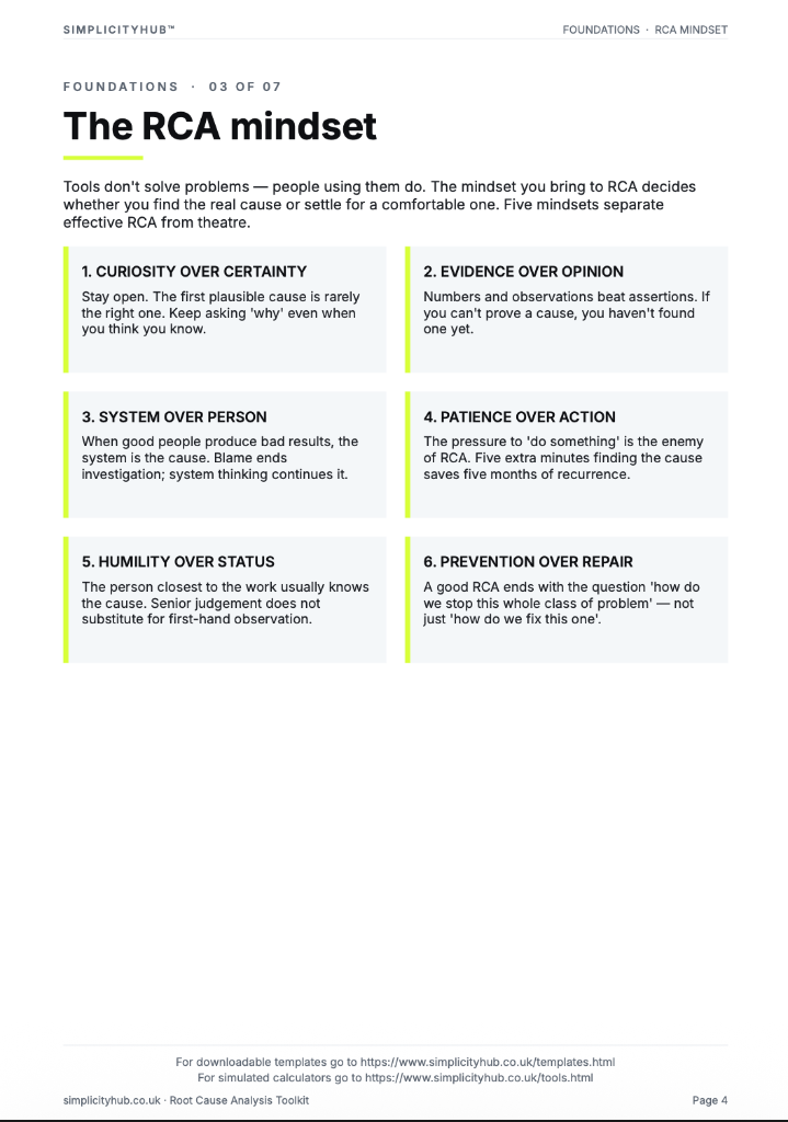
A root cause technique that drills from a problem to its underlying cause by asking Why five times.

What is a Spaghetti Diagram Template?
A Spaghetti Diagram Template provides a layout grid for plotting the physical flow of people, materials or information through a workspace. It makes motion waste visible at a glance.
When to use a Spaghetti Diagram Template
Use it in the Measure phase when motion or transport waste is suspected. Walk the process yourself with a pen and trace every movement. Then count the distance and compare before vs after improvement.
Who should use a Spaghetti Diagram Template
- Green Belts and Black Belts — quantifying motion and transport waste during the Measure and Analyse phases
- Lean practitioners — identifying layout improvement opportunities during Kaizen events or 5S activities
- Operations managers — visualising the inefficiency of current workspace layouts before redesign decisions
- Facilities and engineering teams — using movement data to inform workstation, storage and equipment placement decisions
How to use a Spaghetti Diagram — step by step
-
1Write the problem statement at the top
Start with a clear, factual problem statement. 'Machine stopped' or 'Customer received wrong item' — specific, observable, factual. Vague problems produce vague root causes.
-
2Ask 'Why did this happen?' — Why 1
Write down the first-level cause. This is usually a symptom or a direct cause — not yet the root. Examples: 'Machine overheated', 'Wrong item was picked'.
-
3Ask 'Why did that happen?' — Why 2
Challenge the previous answer. Keep the team focused on causes, not blame. If the answer is 'human error', push further — why did the human make the error?
-
4Continue to Why 3, 4 and 5
Keep going until you reach a cause that is systemic — a missing process, a failed control, a gap in training or a design flaw. The number five is a guide, not a rule.
-
5Check the logic by reading upward
Read the chain back to front: 'Because of X, Y happened, which caused Z.' If the logic holds, you have a valid chain. If it breaks, revisit the step where it breaks.
-
6Identify the actionable root cause
The root cause is the deepest level where a corrective action can prevent recurrence. Document it clearly — this feeds your Improve phase solution design.
-
7Validate before acting
Do not jump to solution immediately. Check whether data or observation confirms the root cause is real and significant before committing resource to fixing it.
Worked example — Pharmacy Dispensing Workflow
A pharmacy team traced the movement of a pharmacist through a single prescription cycle — revealing 87 metres of travel across 14 journeys per prescription, reduced to 23 metres after relocating frequently used stock and reprinting dispensing labels at the point of use.
Common mistakes — and how to avoid them
Only observing one cycle. A single cycle may not be representative. Observe at least 5–10 cycles before drawing conclusions about typical movement patterns.
Drawing the diagram from memory. Movement patterns that seem obvious are often inaccurate from memory. Walk the process with a pen in hand and trace in real time.
Focusing on the person, not the process. The diagram reveals process design failures — poor layout, badly placed equipment, illogical storage — not individual performance issues.
Not measuring the distance. A diagram without distances is a picture, not analysis. Pace out key distances and calculate total travel per cycle.
Tips for getting better results
Involve the operator in the redesign. The person doing the walking knows which journeys are most frustrating and which items they access most frequently. Their input is essential.
Draw both before and after diagrams. The contrast between the tangled before diagram and the simplified after diagram is a powerful story for stakeholders and teams alike.
Combine with a time observation. Record how long each journey takes alongside the distance. Time × frequency = the true cost of motion waste.
Advanced Toolkit Packs — available now
Structured, ready-to-use template packs designed for real improvement work. Pick the pack that matches your project and get started straight away.
Process Improvement Starter Pack
A starter pack for identifying improvement opportunities, measuring baselines and planning action.
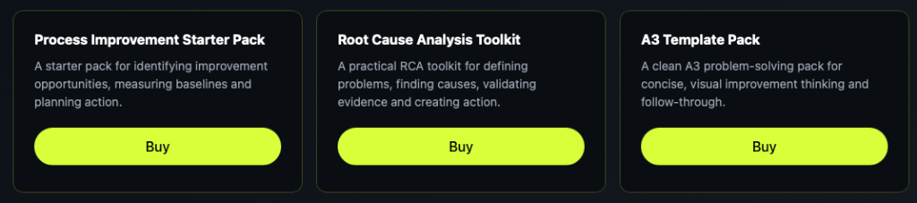
Root Cause Analysis Toolkit
A practical RCA toolkit for defining problems, finding causes, validating evidence and creating action.
A3 Template Pack
A clean A3 problem-solving pack for concise, visual improvement thinking and follow-through.