Box Plot Template
A root cause technique that drills from a problem to its underlying cause by asking Why five times.

What is a Box Plot Template?
A Box Plot Template (Box and Whisker Plot) provides a structured approach for visualising the distribution of data across groups. It displays the median, interquartile range, whiskers and outliers in a single compact chart.
When to use a Box Plot Template
Use it in the Analyse phase to compare process performance across groups (shifts, operators, machines, sites) and quickly identify which groups are driving variation or underperformance.
Who should use a Box Plot Template
- Black Belts and Green Belts — comparing process performance across groups in the Analyse phase to identify where variation is coming from
- Quality analysts and engineers — visualising data distributions and identifying outliers across shifts, products or process conditions
- Operations managers — comparing team or site performance on key metrics in a single visual
- Data scientists and analysts — exploring distributional differences between groups before formal statistical testing
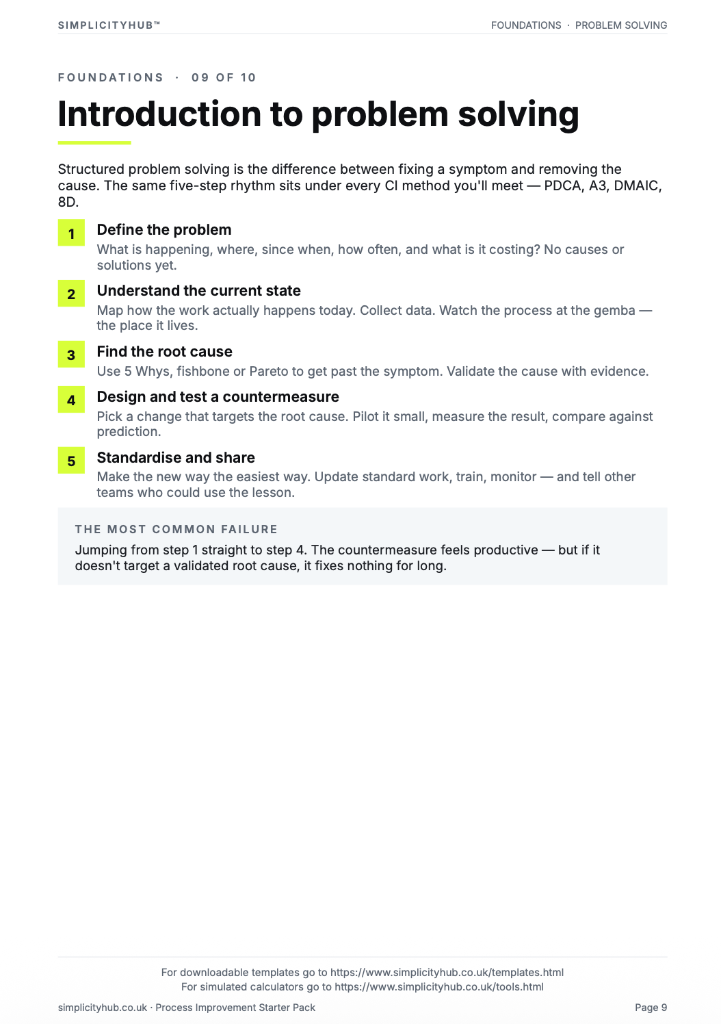
How to use a Box Plot — step by step
-
1Write the problem statement at the top
Start with a clear, factual problem statement. 'Machine stopped' or 'Customer received wrong item' — specific, observable, factual. Vague problems produce vague root causes.
-
2Ask 'Why did this happen?' — Why 1
Write down the first-level cause. This is usually a symptom or a direct cause — not yet the root. Examples: 'Machine overheated', 'Wrong item was picked'.
-
3Ask 'Why did that happen?' — Why 2
Challenge the previous answer. Keep the team focused on causes, not blame. If the answer is 'human error', push further — why did the human make the error?
-
4Continue to Why 3, 4 and 5
Keep going until you reach a cause that is systemic — a missing process, a failed control, a gap in training or a design flaw. The number five is a guide, not a rule.
-
5Check the logic by reading upward
Read the chain back to front: 'Because of X, Y happened, which caused Z.' If the logic holds, you have a valid chain. If it breaks, revisit the step where it breaks.
-
6Identify the actionable root cause
The root cause is the deepest level where a corrective action can prevent recurrence. Document it clearly — this feeds your Improve phase solution design.
-
7Validate before acting
Do not jump to solution immediately. Check whether data or observation confirms the root cause is real and significant before committing resource to fixing it.
Worked example — Comparing Call Handling Times by Shift
A contact centre team plotted call handling times for 4 shifts using box plots — revealing that Shift C had both a higher median (6.2 min vs 4.8 min average) and significantly wider spread, directing the root cause investigation to that specific shift's practices.
Common mistakes — and how to avoid them
Comparing groups with very different sample sizes. A box plot built on 5 data points is not comparable to one built on 50. Ensure group sample sizes are sufficient and broadly similar.
Ignoring outliers. Outliers are not noise to be dismissed — they are signals. Investigate every outlier before removing it from the dataset.
Not labelling group axes clearly. Without clear group labels, a box plot tells you there is variation but not where it comes from. Label every box explicitly.
Using a box plot instead of a control chart for time-series data. Box plots compare groups at a point in time. For monitoring trends over time, use a run chart or control chart instead.
Tips for getting better results
Add individual data points for small samples. For groups with fewer than 20 observations, overlay the raw data points on the box to show the full picture alongside the summary statistics.
Sort boxes by median. Ordering boxes from lowest to highest median makes performance differences immediately visible without requiring the reader to scan the chart.
Use notched box plots for significance testing. Notched box plots show confidence intervals around the median. If notches don't overlap between groups, the medians are significantly different — a quick visual test.
Advanced Toolkit Packs — available now
Structured, ready-to-use template packs designed for real improvement work. Pick the pack that matches your project and get started straight away.
Process Improvement Starter Pack
A starter pack for identifying improvement opportunities, measuring baselines and planning action.
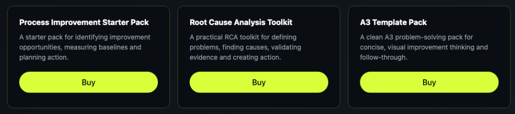
Root Cause Analysis Toolkit
A practical RCA toolkit for defining problems, finding causes, validating evidence and creating action.
A3 Template Pack
A clean A3 problem-solving pack for concise, visual improvement thinking and follow-through.