What is a Data Summary Sheet Template?
A Data Summary Sheet presents the key statistical outputs of a data collection exercise in a clear, structured format — mean, median, range, standard deviation, sample size and key distributional observations — ready for sharing with a team or sponsor without requiring them to interpret raw data.
It bridges the gap between raw data collection and analysis by providing a standardised summary that is consistent, auditable and easy to communicate. It ensures that everyone in the project review is working from the same numbers.
Used at the end of the Measure phase and at the start of the Analyse phase, it is the data handoff document that turns collected measurements into a shared analytical foundation.
When to use a Data Summary Sheet Template
Complete a Data Summary Sheet after each data collection exercise. Use it when:
- Data collection is complete and the team needs a shared reference point for analysis
- A sponsor or finance team requires a summary of the data that underpins the project baseline
- Multiple datasets need to be compared and a consistent format makes comparison easier
- The raw data is too large to present directly and a summary is needed for project reviews
Who should use a Data Summary Sheet Template
- Green Belts and Black Belts — at the transition from Measure to Analyse on every DMAIC project
- Data Analysts — when presenting data findings to non-technical stakeholders
- Finance Teams — when validating the data underpinning savings claims
- CI Coaches — to help project teams present their measurement findings clearly and consistently
Watch: a quick explainer
New to this? This short video walks you through gathering and summarising the right evidence — a helpful primer before you download and use the template.

How to complete the Data Summary Sheet
Complete the summary sheet alongside your analysis tools — run chart, histogram, control chart. The summary statistics and the visual outputs together tell a more complete story than either alone.
How to complete the Data Summary Sheet — step by step
-
1Record the metric name and operational definition
State exactly what was measured and how — referencing the operational definition from the data collection plan. This ensures the summary is self-contained and unambiguous.
-
2Record the data collection period and sample size
State when data was collected, over what period, and how many observations (n). Without this context, the statistics cannot be interpreted correctly.
-
3Calculate and record mean and median
Calculate both. If the mean and median are very different, the data is skewed — note this as it affects which statistical tools are appropriate for analysis.
-
4Calculate range and standard deviation
Range (max minus min) shows the spread. Standard deviation quantifies variation relative to the mean. Record both and note any outliers that significantly affect these figures.
-
5Plot and attach a run chart or histogram
Attach a visual output — run chart for time-series data, histogram for distributional data. The chart often reveals patterns that the statistics alone hide.
-
6Note key observations
In plain language, describe what the data shows: 'Performance is worse on Mondays and Fridays', 'There is a wide spread with several extreme outliers above 10 days', 'The process appears stable with no obvious trends.'
-
7Flag data quality issues
Note any gaps, anomalies or collection issues: missing data for two weeks due to a system outage, inconsistent recording in the first week, different observers producing different results. These affect how the data should be interpreted.
Worked example — Call Wait Time Data Summary
A completed Data Summary Sheet for a call centre wait time study, showing mean, median, standard deviation, range, sample size, a histogram and key observations about right-skew and Friday outliers.
Common mistakes — and how to avoid them
Reporting only the mean. The mean alone hides variation. A mean of 4.8 minutes looks acceptable until you see the standard deviation is 2.4 minutes and some calls waited 18 minutes. Always report spread alongside the average.
Not attaching a visual. Numbers without a chart are harder to interpret and easier to misunderstand. The summary sheet is incomplete without at least one visual — histogram or run chart.
Glossing over data quality issues. Data with gaps, anomalies or collection inconsistencies needs to be flagged, not hidden. A clean-looking summary built on flawed data produces wrong conclusions.
Mixing data from different conditions. If data from two different shifts, systems or periods has been combined, the summary statistics may not represent either condition accurately. Stratify and summarise separately where conditions differ.
Tips for getting better results
Include a box plot alongside the histogram. A box plot shows median, quartiles and outliers in a single visual and is easier to compare across groups than overlapping histograms. Add one when comparing multiple data groups.
State the source for every number. Every statistic on the summary sheet should be traceable to the raw data. Add a footnote: 'Source: CRM extract, 01 Jan – 31 Mar 2026, filtered to closed complaints only.'
Use the summary sheet in the phase gate review. The Measure phase gate review should include the Data Summary Sheet as a formal deliverable — evidence that baseline data has been collected, is reliable and is sufficient to support analysis.
Download the Data Summary Sheet Template
A clean, editable Excel template for immediate use — structured, professional and ready to fill in.
Frequently asked questions
What statistics should I include?
Mean, median, standard deviation, minimum, maximum, and sample size as a minimum.
How should I handle outliers?
Do not remove without investigation. If a genuine one-off, document and remove with explanation.
Can I use it to present to the sponsor?
Yes — translate statistics into plain language: cost per month, defects per 1,000 transactions.
How often should it be updated?
Once after Measure with baseline data, and again after Improve for comparison.
Advanced Toolkit Packs — available now
Structured, ready-to-use template packs designed for real improvement work. Pick the pack that matches your project and get started straight away.
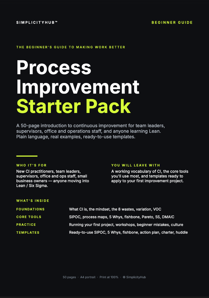
Process Improvement Starter Pack
A starter pack for identifying improvement opportunities, measuring baselines and planning action.

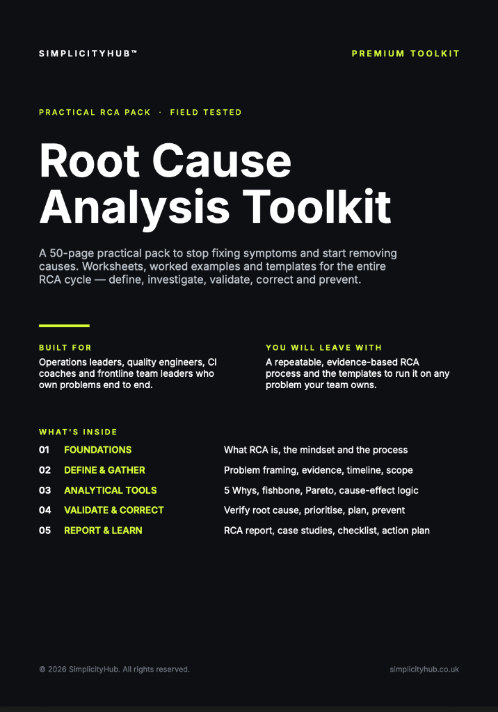
Root Cause Analysis Toolkit
A practical RCA toolkit for defining problems, finding causes, validating evidence and creating action.
A3 Template Pack
A clean A3 problem-solving pack for concise, visual improvement thinking and follow-through.