What is a Run Chart Template?
A run chart is a simple graph that plots data points over time in sequence — showing how a process metric changes from one time period to the next. It is the first step in understanding process behaviour before applying statistical tests.
Unlike a bar chart or pie chart, a run chart preserves the time order of data, making patterns visible: trends (consistently going up or down), shifts (a sudden change in level), cycles (repeating patterns) and outliers (single unusual values).
Run charts are used in the Measure phase to baseline process performance and in the Control phase to monitor whether improvements are being sustained over time.
When to use a Run Chart Template
Use a run chart whenever you have data collected in time order and want to understand how the process behaves over time. Use it when:
- You want to plot baseline data to understand current process performance
- You suspect a trend or shift has occurred in the process
- You want a simple visual to show a sponsor how performance has changed
- You are monitoring post-improvement performance in the Control phase
Who should use a Run Chart Template
- All belt levels — run charts are one of the seven basic quality tools and require no statistical software
- Team Leaders and Supervisors — for daily or weekly monitoring of key performance metrics
- Quality and Operations Teams — to detect trends and shifts in process data
- Green Belts and Black Belts — as a precursor to control charts and more advanced statistical analysis
Watch: a quick explainer
New to this? This short video walks you through reading a run chart to spot real process changes — a helpful primer before you download and use the template.

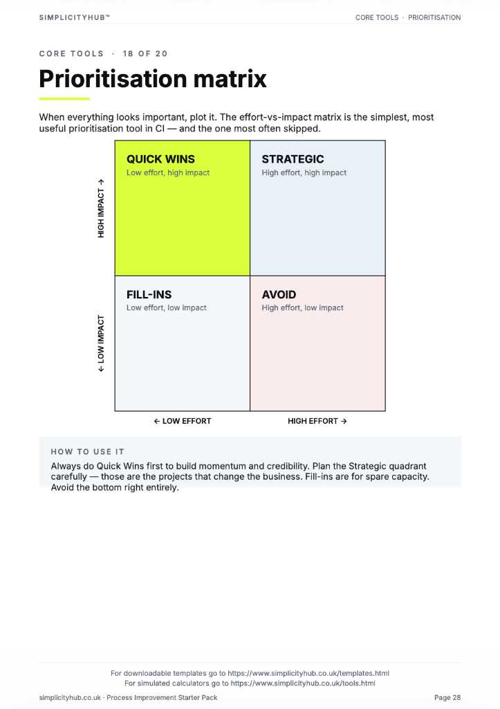
How to build and read a run chart
A run chart has two axes: time on the x-axis and the metric value on the y-axis. Every data point is plotted in time order and connected by a line. The median is drawn as a reference line.
How to build and read a run chart — step by step
-
1Collect data in time order
Gather your data points in the sequence they were produced — daily figures, weekly averages, batch results. Do not sort or re-order. The time sequence is the whole point.
-
2Plot each point in sequence
Put time on the x-axis (dates, weeks, batches) and the metric on the y-axis. Plot each data point and connect with a line.
-
3Calculate and draw the median
Find the median value and draw it as a horizontal reference line across the chart. The median is more robust than the mean for detecting patterns.
-
4Look for runs above or below the median
A run is a sequence of consecutive points on the same side of the median. Eight or more consecutive points on one side signals a non-random pattern — something has changed.
-
5Look for trends
Six or more consecutive points steadily going up or going down indicates a trend — the process is systematically shifting in one direction.
-
6Look for cycles
A repeating pattern of ups and downs — higher on Mondays, lower midweek — is a cycle and points to a time-based cause such as shift patterns, batch schedules or weekly demand fluctuations.
-
7Annotate significant events
Mark on the chart when process changes occurred, when new staff started, when equipment was serviced. This helps interpret patterns and connect them to causes.
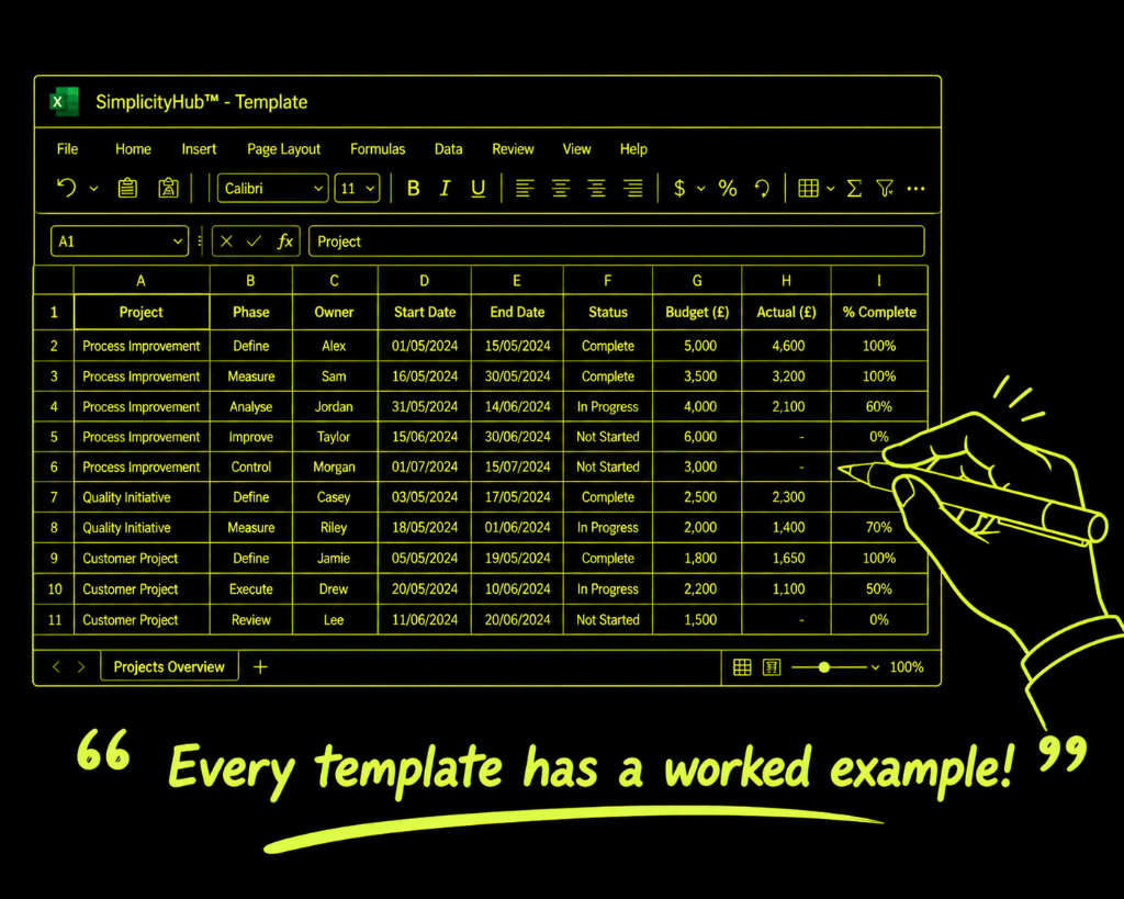
Worked example — Daily Order Lead Time Run Chart
A completed run chart for daily order lead times over 12 weeks, showing the median reference line and a highlighted run of eight consecutive points above median in weeks 7–9.
Common mistakes — and how to avoid them
Plotting averages without checking for stratification. If your weekly average combines data from two different shifts or processes, patterns within each will be invisible. Plot stratified data where possible.
Using the mean instead of the median. The mean is sensitive to outliers. The median is more stable and gives more reliable pattern detection. Always use the median as the reference line on a run chart.
Treating every variation as a signal. Not every fluctuation means something has changed. Use the run rules (eight consecutive points on one side, six consecutive points in a trend) to distinguish signal from noise.
Not annotating the chart. A run chart with no context is hard to interpret. Add annotations for process changes, known events and when measurements were taken. This turns a chart into a story.
Tips for getting better results
Use run charts before control charts. A run chart requires no software and can be done in Excel or on paper. Build it first to understand the data. If you need more rigorous pattern detection, move to a control chart.
Plot your data before calculating statistics. The chart often reveals patterns — bimodal distributions, outliers, trends — that summary statistics (mean, standard deviation) completely hide. Always plot first.
Show the target on the chart. Adding the target or specification limit as a reference line shows how current performance compares to what is required — not just how it compares to itself.
Download the Run Chart Template
A clean, editable Excel template for immediate use — structured, professional and ready to fill in.
Frequently asked questions
Run chart vs control chart?
A run chart has just a median or mean line. A control chart adds statistically derived control limits.
What patterns should I look for?
Trends (6 or more consecutive points in one direction), shifts (8 or more on one side of median), and repeating cycles.
How many data points do I need?
At least 20-25 to identify meaningful patterns.
Can it show improvement?
Yes — plot pre- and post-improvement data with a vertical line at implementation to show the shift.
Advanced Toolkit Packs — available now
Structured, ready-to-use template packs designed for real improvement work. Pick the pack that matches your project and get started straight away.
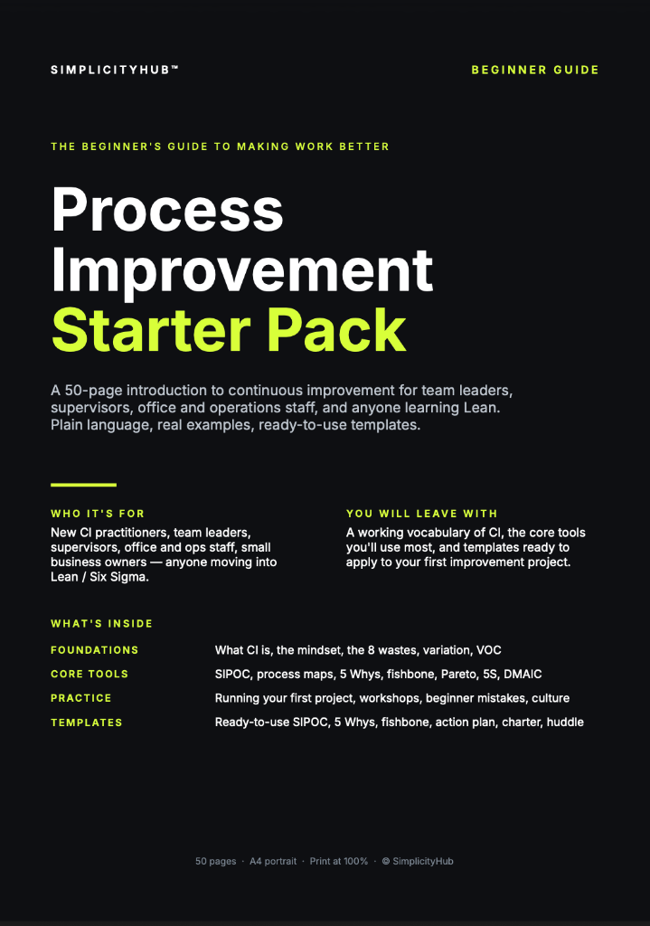
Process Improvement Starter Pack
A starter pack for identifying improvement opportunities, measuring baselines and planning action.
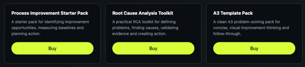
Root Cause Analysis Toolkit
A practical RCA toolkit for defining problems, finding causes, validating evidence and creating action.
A3 Template Pack
A clean A3 problem-solving pack for concise, visual improvement thinking and follow-through.