Quick answer: A run chart plots data over time with a median line and is best in the Measure phase when baselines do not yet exist. A control chart adds statistically calculated control limits, letting you distinguish common cause from special cause variation. They are sequential tools, not competing ones: start with a run chart, convert it into a control chart once you have enough stable data.
Two Tools, One Job, Different Stages
Most comparisons frame this as a complexity tradeoff. Run charts for beginners, control charts for experts. That framing misses the point.
A run chart is a line graph that displays observed data in a time sequence, showing how a process changes over time. A control chart is a statistical tool that distinguishes between common cause variation (inherent to the process) and special cause variation (indicating an issue that needs attention). Both track process behaviour over time. The difference is not difficulty. It is what each tool can tell you, and that depends on where you are in your project.
A run chart works when you have 10 to 15 data points and no established baseline. A control chart requires at least 20 sequential in-control points before its limits are statistically valid. If you are in the Measure phase of a DMAIC project collecting early data, a run chart is the right tool. If you are monitoring a process that has been stabilised and you need to detect assignable causes of variation, a control chart is the right tool. The question is not "which is better" but "which phase am I in."
You can turn a run chart into a control chart by adding upper and lower control limits. They sit on a continuum, not on opposite shelves.
What a Run Chart Actually Shows You
A run chart has two components: a time series (time on the horizontal axis, the measured variable on the vertical) and a median line, a horizontal line representing the median value of the dataset. That is it. No calculated boundaries, no standard deviation zones. Plot the points, draw the median, read the pattern.
Run charts are typically used in the Measure phase of a DMAIC project to identify trends or shifts and to test for randomness in the process. They require a minimum of 10 to 15 data points collected in time sequence. Because they need minimal statistical knowledge to draw and interpret, they are useful for communicating process performance to stakeholders who are not statistically trained.
The limitation is equally clear: a run chart cannot detect out-of-control conditions because it has no control limits. It can reveal shifts and trends. It cannot tell you whether variation is built into the process or caused by something external.
Reading a Run Chart: Four Signal Rules
A run chart is not just a line going up and down. Four patterns signal that something beyond random variation is happening.
Shift. Seven or eight values in succession above or below the median line indicate a shift. Points that fall exactly on the median are excluded from the count. A shift signals a dramatic, sustained change in process performance.
Trend. Seven or more consecutive points consistently increasing or decreasing indicate a trend. The rule of thumb: seven or eight successive points heading the same direction means the trend is real and the process needs attention.
Clustering and mixtures. Too many points near the median (clustering) or too few (mixtures, where points alternate between far above and far below) both indicate non-random behaviour. Swed and Eisenhart developed a chart in 1943 to determine the minimum and maximum number of runs expected in a dataset if only random variation is present. If the observed number of runs falls outside those bounds, the data is not random.
These rules give a run chart genuine analytical power. They just cannot separate common cause from special cause, which is where the control chart takes over.
What a Control Chart Adds
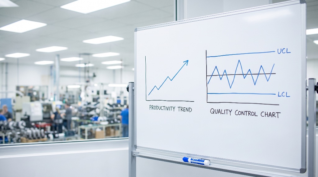
A control chart always includes three reference lines: a central line for the average, an upper control limit (UCL), and a lower control limit (LCL). All three are determined from historical data.
That structure is the critical upgrade. Where a run chart uses only the median, control charts use statistically calculated boundaries that help determine if a process is in control. The ability to distinguish between common cause variation and special cause variation is what makes a control chart more powerful for identifying process instability.
Common cause variation is built into the process. It is the natural spread you expect. Special cause variation comes from something identifiable, something you can investigate and act on. A run chart shows you that something changed. A control chart tells you whether that change is signal or noise.
Reading a Control Chart: Four Out-of-Control Signals
The ASQ identifies four patterns that indicate a process is out of statistical control.
A single point outside the control limits. The clearest signal. One data point beyond the UCL or LCL means something assignable happened at that moment.
Two out of three successive points on the same side of the centreline and farther than 2σ from it. Not as obvious as a single outlier, but statistically unlikely under normal variation.
Four out of five successive points on the same side of the centreline and farther than 1σ from it. A subtler pattern. The process is drifting, even if no single point has breached a limit.
Eight in a row on the same side of the centreline. A sustained shift that the process mean has moved, even though individual points may still fall within limits.
One important caveat: when starting a new control chart, the initial control limits calculated from the first 20 points are conditional. If the process is out of control during that initial period, those limits are unreliable. Recalculate once you have at least 20 sequential points from a period when the process is operating in control.
Which Chart Types Exist, and Which Data They Need
Not every control chart is the same. The type depends on your data.
X-bar and R charts are used for continuous data with subgroups. If you are measuring cycle times, weights, or dimensions and collecting multiple samples per time period, this is the standard choice. Control charts for variable data are used in pairs: one chart monitors the average (centering) and one monitors the range (spread). The average chart tells you whether the process has shifted. The range chart tells you whether the process has become more or less variable.
p-charts handle attribute data, specifically pass/fail outcomes. If you are tracking the proportion of defective units in each batch, a p-chart is the right tool.
c-charts track count data, specifically the number of defects per unit. If a single unit can have multiple defects (scratches on a panel, errors on an invoice), a c-chart counts those occurrences.
When to Use Each: A Decision Framework
Use a run chart when:
- You are in the early stages of a project and collecting baseline data. Run charts belong in the Measure phase of DMAIC.
- You have 10 to 15 data points but not enough stable data for valid control limits.
- You need to visually depict how a process is performing and communicate that to a mixed audience.
- You want to track and communicate improvements over the course of a project.
- You need a quick view of whether trends or shifts exist before investing in full statistical analysis.
Use a control chart when:
- You are controlling ongoing processes by finding and correcting problems as they occur.
- You need to predict the expected range of outcomes from a process.
- You want to determine whether a process is stable (in statistical control).
- You are analysing patterns of process variation from special causes or common causes.
- You need to decide whether your quality improvement project should aim to prevent specific problems or make fundamental changes to the process.
The upgrade path. You can convert a run chart into a control chart by adding upper and lower control limits. In practice, this means collecting data with a run chart during the Measure phase, establishing process stability, and then calculating control limits from at least 20 in-control points to create a control chart for ongoing monitoring. The run chart was the starting gun. The control chart is the sustained monitor.
For more on interpreting control charts and applying statistical process control in practice, those guides walk through the mechanics in detail.
Run Chart vs Control Chart: Side-by-Side Comparison
| Feature | Run Chart | Control Chart |
|---|---|---|
| Reference line | Median line only | Centreline (average) plus UCL and LCL |
| Variation detection | Trends and shifts only | Common cause and special cause variation |
| Minimum data needed | 10 to 15 points | 20+ sequential in-control points for valid limits |
| Statistical complexity | Minimal calculation required | Requires standard deviation and control limit calculations |
| DMAIC phase fit | Measure phase baseline | Control phase ongoing monitoring |
| Primary use case | Early trend detection and communication | Process stability assessment and assignable cause identification |
| Can detect out-of-control conditions | No | Yes |
| Upgrade path | Can be converted to a control chart | N/A |
The practical takeaway: if you are asking "run chart or control chart," check where your project stands. Sparse data and no baseline? Run chart. Enough stable history to calculate limits? Control chart. They are stages, not alternatives.