How to Read a Control Chart: P-Chart, I-Chart, and When to Use Each
By The SimplicityHub Team
A control chart answers one question, and it's a more important question than most people realise: is this variation something I should react to, or is it just normal noise? Getting that wrong in either direction is expensive — either you chase phantom problems that were never real, or you ignore a genuine shift until it becomes a customer complaint.
Choosing and Reading Your Chart
The core idea: common cause vs special cause
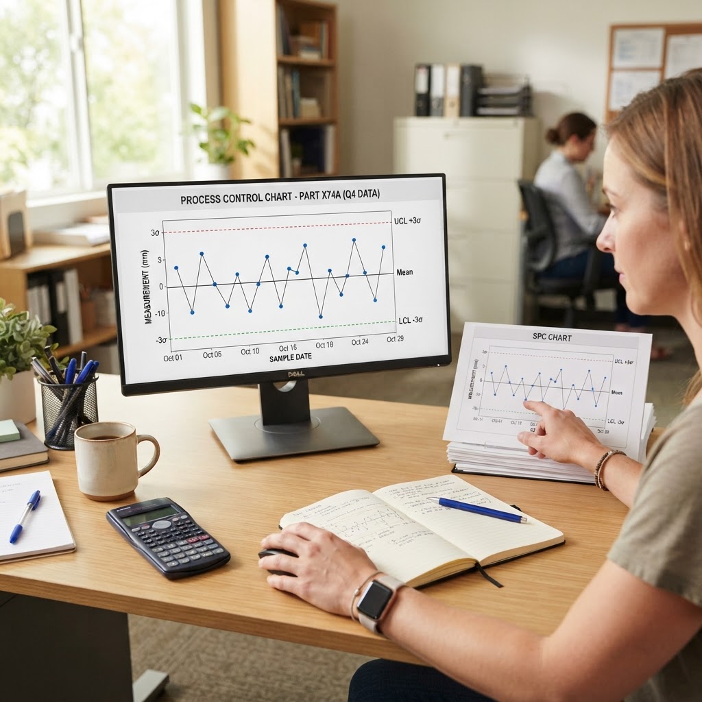
Every process has natural variation — Walter Shewhart called this "common cause" variation, and it's expected and stable[1]. A control chart plots your data over time against statistically calculated upper and lower control limits (typically ±3 standard deviations from the process mean). When a point falls outside those limits, or a run of points shows a non-random pattern, that's "special cause" variation — something changed, and it's worth investigating. The chart's entire job is to stop you overreacting to normal noise while still catching real shifts quickly.
I-Chart (Individuals Chart)
Use an I-Chart when you're measuring one continuous value per unit or per time period — a temperature reading, a cycle time, a fill weight — and you can't or don't want to group measurements into subgroups. It's the simplest control chart to set up and read, which makes it a good default for low-volume or slow processes where you only get one data point per batch.
P-Chart (Proportion Chart)
Use a P-Chart when you're tracking a proportion or percentage defective within a sample — for example, "12 defective units out of a 200-unit sample." Unlike the I-Chart, the P-Chart's control limits actually widen or narrow depending on your sample size, because a defect rate calculated from a small sample is naturally noisier than one from a large sample. This is the chart to reach for whenever your data is pass/fail or good/bad rather than a continuous measurement.
Quick decision guide
- Continuous measurement, one reading at a time → I-Chart
- Continuous measurement, rational subgroups available → X-bar and R chart
- Attribute data (pass/fail), constant sample size → np-Chart
- Attribute data (pass/fail), varying sample size → P-Chart
- Counting defects per unit (not just pass/fail) → C-Chart or U-Chart
Reading the chart: patterns that matter
Beyond a single point outside the control limits, watch for: seven or more consecutive points on one side of the centre line (a sustained shift), a clear upward or downward trend across six or more points (drift), and unusually low variation that hugs the centre line tightly (which can indicate the process has genuinely improved — or that the measurement system itself has stopped detecting real variation).
Building your first control chart is far easier with the right inputs already calculated. Our free control limits & SPC calculator will work out your control limits automatically from your own data, so you can start monitoring in minutes rather than working the formulas by hand.
- American Society for Quality (ASQ), "Control Chart: Basics, Examples & Types" — asq.org