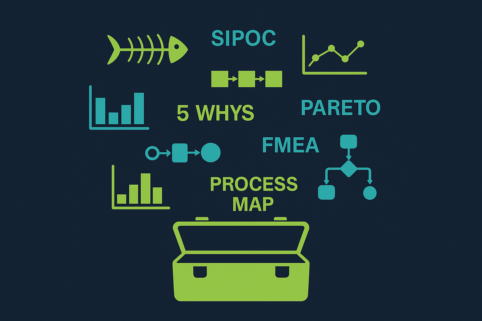
You don't need to know every Lean Six Sigma tool. You need to know the right ones. Here are the 10 most practical, high-impact tools — and exactly when to use each one.
You don't need to master every tool in the Lean Six Sigma toolkit. These 10 cover the vast majority of improvement challenges you'll face — from defining a problem clearly, to finding its root cause, to making sure the fix sticks.
A SIPOC (Suppliers, Inputs, Process, Outputs, Customers) diagram gives everyone the same picture of a process before any detailed mapping begins. It stops teams wasting hours mapping the wrong scope. Use it at the very start of a project to align stakeholders on what is — and isn't — in scope. A SIPOC typically fits on a single page and takes less than an hour to build with a team. The process column should show no more than five to seven high-level steps; if you need more, you're mapping at the wrong level. Once agreed, it becomes the reference point for all subsequent analysis.
Free SIPOC Template →A process map shows every step in a process as it actually runs today — not as the procedure says it should run. The gap between those two is almost always where problems live. Use swimlane maps when handoffs between departments or roles are the source of delay or error. Walk the process yourself rather than relying on what people say — documented procedures and reality regularly diverge. Mark each step as value-adding, non-value-adding but necessary, or pure waste. This classification immediately shows where improvement effort should go.
Free Process Map Template →A control chart is the primary tool for understanding process variation. It distinguishes between common cause variation — the natural, predictable noise in any process — and special cause variation, which signals something has genuinely changed. Reacting to common cause as if it were special cause (over-adjustment) makes performance worse. Ignoring special cause because you assume it's noise means real problems go unfixed. Use a control chart during the Measure phase to baseline your process and return to it in the Control phase to confirm your improvements are holding. The control limits are calculated from your own data — they are not targets.
Try the Free DPMO Calculator →A Fishbone diagram structures root cause brainstorming around six standard categories — Man, Machine, Method, Material, Measurement, and Environment (the 6Ms). It prevents teams from jumping to the most obvious or most recent cause and ignoring systemic factors. Use it in a facilitated session with the people who actually do the work — they see causes that managers miss. The fishbone is a hypothesis generator; every branch should be validated with data before becoming the focus of a solution. Pair it with a 5 Whys analysis on the most likely branches to reach the actionable root cause.
Free Fishbone Template →The Pareto principle — that roughly 80% of problems come from 20% of causes — is one of the most consistently observed patterns in process improvement. A Pareto chart makes this visible by ranking causes or defect types from most frequent to least, with a cumulative percentage line overlaid. Use it when you have a long list of potential causes and need to focus effort where it will have the most impact. The chart works on defect types, failure modes, complaint categories, delay reasons — any situation where frequency data exists. The goal is not to fix everything; it is to fix the vital few causes that drive the majority of the problem.
Free Pareto Chart Calculator →5 Whys is a deceptively simple technique: ask why a problem occurred, then ask why that answer is true, and repeat until you reach a cause you can actually fix. Most teams stop at the first or second why — which is why they keep solving the same problems. The number five is a guide rather than a rule; some problems need three iterations, others need seven. The key test is whether the final answer is systemic — a missing standard, a failed process design, a gap in training — rather than a person. If the chain ends in someone's name rather than a system failure, you haven't gone far enough.
Free 5 Whys Template →An A3 is a one-page structured problem-solving document — named after the paper size — that captures the full arc of a problem on a single sheet: background, current condition, root cause, target state, countermeasures, implementation plan, and results. It originated in Toyota and remains one of the most practical tools for focused problems that don't need a full DMAIC project. Because everything is visible on one page, an A3 forces clarity and prevents over-engineering the analysis. It is equally useful as a coaching tool — a manager reviewing an A3 can immediately see whether the thinking is rigorous or has skipped steps.
Free A3 Template →A Value Stream Map (VSM) shows the complete flow of material and information required to deliver a product or service to a customer — from raw request to completion. Unlike a process map, which shows steps, a VSM shows time: how long each step takes, how long material waits between steps, and what percentage of total lead time is actually value-adding. In most operations, value-adding time is less than 10% of the total. The VSM makes that visible and focuses improvement effort on the biggest sources of delay. Draw the current-state map first, then design a future-state map as the improvement target.
Free VSM Template →Takt time is the pace at which you need to produce to meet customer demand — calculated by dividing available production time by the number of units required. It is the heartbeat of a Lean operation. If your cycle time (how long each step actually takes) exceeds takt time, you will consistently fall short of demand. If every step runs slower than takt, you have a capacity problem. If some steps run faster and others slower, you have a flow imbalance. Takt time gives you the objective standard against which to balance a production line, staff a service team, or sequence a workflow. Without it, improvement targets are guesswork.
Free Takt Time Calculator →Overall Equipment Effectiveness (OEE) is the standard measure of how well manufacturing equipment is being used. It combines three factors: Availability (what percentage of planned time is the machine actually running), Performance (how fast is it running relative to its rated speed), and Quality (what percentage of output meets specification first time). World-class OEE is considered to be 85% — most facilities start significantly below this. OEE is valuable not just as a number but because it tells you which of the three factors to address first. A low Availability score means downtime is the issue. Low Performance points to speed losses. Low Quality highlights rework and scrap. Each requires a different improvement approach.
Free OEE Calculator →The most effective improvement projects use tools in sequence, not in isolation. Here are the combinations that consistently deliver results across a DMAIC project:
SimplicityHub has free templates and calculators for every tool listed above — no sign-up required for most downloads.