What is a Correlation Analysis Template?
Correlation analysis measures the strength and direction of the statistical relationship between two variables — typically a suspected cause (X) and the process output (Y). The Pearson correlation coefficient (r) ranges from -1 (perfect negative correlation) to +1 (perfect positive correlation), with 0 indicating no linear relationship.
Correlation analysis is used in the Analyse phase to test whether a suspected X variable is genuinely associated with the Y before investing in solving it. It prevents teams from spending time and money fixing causes that have no statistical relationship with the problem.
Importantly, correlation does not prove causation — a correlation between two variables may be explained by a third variable affecting both. Always validate statistical findings with process knowledge before acting.
When to use a Correlation Analysis Template
Use correlation analysis when you have continuous data on two variables and want to test whether they move together. Use it when:
- You want to test whether a suspected input variable (X) is statistically related to the process output (Y)
- A team member claims that variable X causes the problem but has no data to support it
- You have a list of potential causes from a fishbone and want to prioritise which to investigate further
- You want to identify which process inputs have the strongest relationship with output quality
Who should use a Correlation Analysis Template
- Green Belts and Black Belts — in the Analyse phase to validate suspected cause-and-effect relationships
- Data Analysts — when exploring relationships in process or quality data
- Black Belts and MBBs — as a precursor to regression analysis for quantifying the X-Y relationship
- Quality Engineers — when investigating the drivers of process variation or defect rates
Watch: a quick explainer
New to this? This short video walks you through testing whether two things are genuinely related — a helpful primer before you download and use the template.

How to conduct a Correlation Analysis
Always plot a scatter diagram before calculating the correlation coefficient. A scatter diagram reveals whether the relationship is linear (suitable for Pearson correlation), non-linear (requiring a different approach) or driven by outliers.
How to conduct a Correlation Analysis — step by step
-
1Collect paired data on X and Y
Collect matched pairs of data: for each observation, record both the X value and the Y value at the same point in time. Sample size of at least 30 paired observations gives reliable correlation estimates.
-
2Plot a scatter diagram
Plot X on the horizontal axis and Y on the vertical axis. Each point represents one paired observation. Look for a pattern: upward trend (positive), downward trend (negative), or no pattern (no correlation).
-
3Check for linearity
Pearson correlation only captures linear relationships. If the scatter plot shows a curve rather than a straight line, use Spearman rank correlation instead, or consider a non-linear regression model.
-
4Calculate the Pearson correlation coefficient (r)
r = Σ((X-X̄)(Y-Ȳ)) / √(Σ(X-X̄)² × Σ(Y-Ȳ)²). In practice, use Excel (CORREL function) or statistical software. r > 0.7 is a strong positive correlation; r < -0.7 is strong negative.
-
5Test for statistical significance
A correlation coefficient may be large but not statistically significant if the sample is small. Calculate the p-value (t = r√(n-2)/√(1-r²)) or use software. p < 0.05 confirms the correlation is statistically significant.
-
6Interpret the result in context
A statistically significant correlation means the relationship is unlikely to be due to chance. But it does not prove X causes Y. Validate with process knowledge: is there a plausible mechanism by which X affects Y?
-
7Document and present findings
Include the scatter diagram, the r value, the sample size and the p-value. State the practical interpretation: 'There is a strong, statistically significant positive correlation between ambient temperature and defect rate (r=0.78, p<0.01, n=45).'
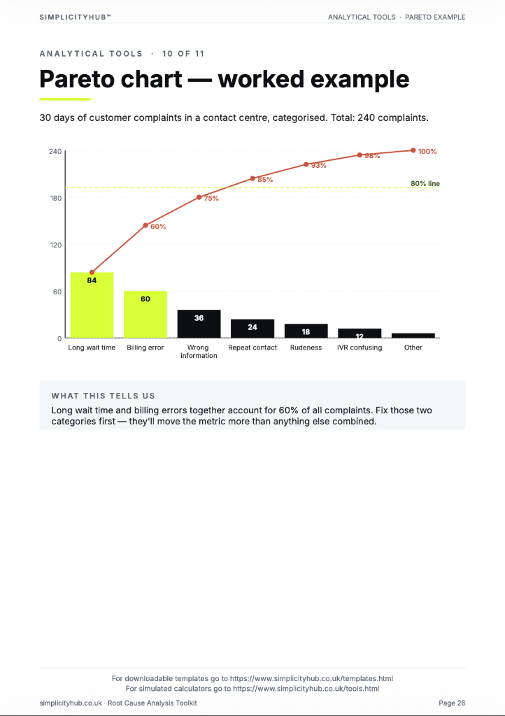
Worked example — Temperature vs Defect Rate Analysis
A completed correlation analysis for ambient temperature and production defect rate, showing scatter diagram, Pearson r=0.78, p-value and interpretation.
Common mistakes — and how to avoid them
Acting on correlation without confirming causation. A correlation between X and Y may be caused by a third variable Z affecting both. Always validate statistical correlation with a plausible causal mechanism before designing a solution.
Not plotting the scatter diagram first. A correlation coefficient calculated without a scatter diagram can miss non-linear relationships, outliers and data entry errors. Always visualise before calculating.
Small sample sizes. A Pearson r of 0.6 from n=10 is not statistically significant. Calculate the p-value — or as a rule of thumb, use at least 30 paired observations for reliable correlation estimates.
Confusing correlation strength with practical significance. A correlation of r=0.3 may be statistically significant with a large sample but explains only 9% of the variation in Y. Statistical significance and practical significance are different — report both.
Tips for getting better results
Calculate r² to understand explained variation. r² (coefficient of determination) tells you what percentage of the variation in Y is explained by X. r=0.78 means r²=0.61 — X explains 61% of the variation in Y. This is a more intuitive measure of practical significance than r alone.
Use correlation as a screening tool. When you have many candidate X variables, correlation analysis screens out those with no relationship to Y quickly. The strongly correlated variables are then investigated further with regression or designed experiments.
Test for spurious correlation. Two variables can be correlated not because they are related but because both are driven by a third variable (time, volume, external factor). Always check whether a third variable could explain the observed relationship.
Download the Correlation Analysis Template
A clean, editable Excel template for immediate use — structured, professional and ready to fill in.
Frequently asked questions
What does correlation tell me?
The strength and direction of a linear relationship between two variables. It does not tell you which causes which.
What is a good correlation coefficient?
In manufacturing, r above 0.8 is strong. In transactional processes, r above 0.6 may be meaningful.
Correlation vs causation?
Two variables can be correlated without one causing the other. Use correlation to generate hypotheses then design further analysis.
How much data do I need?
A minimum of 30 paired data points.
Advanced Toolkit Packs — available now
Structured, ready-to-use template packs designed for real improvement work. Pick the pack that matches your project and get started straight away.
Process Improvement Starter Pack
A starter pack for identifying improvement opportunities, measuring baselines and planning action.


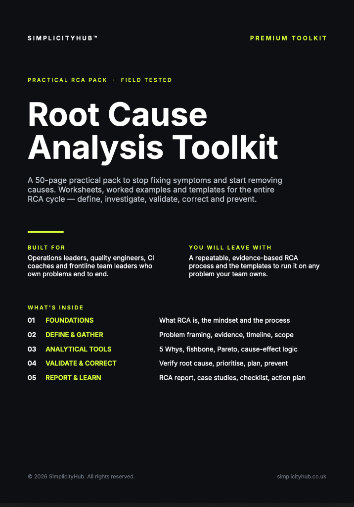
Root Cause Analysis Toolkit
A practical RCA toolkit for defining problems, finding causes, validating evidence and creating action.
A3 Template Pack
A clean A3 problem-solving pack for concise, visual improvement thinking and follow-through.