What is a Monitoring Dashboard Template?
A Monitoring Dashboard Template provides a structured one-page view of the key metrics needed to track process health over time. It combines current performance, trends and traffic-light status to give managers and process owners instant situational awareness.
When to use a Monitoring Dashboard Template
Use it in the Control phase as the primary ongoing monitoring tool handed over to the process owner. Review it at a defined frequency — daily for operational processes, weekly for project KPIs — to detect problems early.
Who should use a Monitoring Dashboard Template
- Process owners — monitoring the health of their process after improvement implementation
- Operations and site managers — reviewing performance across multiple processes in a structured daily or weekly review
- Black Belts — confirming that post-improvement performance is sustaining before project closure
- Senior leaders — reviewing a portfolio of process metrics in a concise, consistent format
Vote yes and we’ll prioritise a quick walkthrough showing you exactly how to use it.
How to use a Monitoring Dashboard — step by step
- 1Define the critical metrics
Select 5–10 metrics that directly reflect process health: quality, speed, cost, safety and customer satisfaction.
- 2Set performance targets and thresholds
For each metric, define the target, an amber warning threshold and a red action threshold.
- 3Assign a data owner for each metric
Every metric needs a named person responsible for collecting, updating and reviewing it.
- 4Design the visual layout
One metric per panel, clear labels, trend indicator (up/down/flat) and RAG colour. Designed for 10-second comprehension.
- 5Establish the review cadence
Daily for operational dashboards. Weekly or monthly for strategic or project KPI dashboards.
- 6Define the escalation rules
What triggers a review meeting? What triggers a phone call? What triggers an escalation to the next management level?
- 7Hand over to the process owner
Walk the process owner through every metric, data source and escalation rule before project closure.
Worked example — Logistics Operations Monitoring Dashboard
A logistics team built an 8-metric monitoring dashboard covering on-time delivery, vehicle utilisation, damage rate, fuel cost per mile, driver compliance, customer complaints, route efficiency and absence — reviewed in a 15-minute daily team meeting.
Common mistakes — and how to avoid them
Too many metrics. A dashboard with 20 metrics means nothing gets proper attention. Limit to the 8–10 metrics that are truly critical.
No trend data. A single data point tells you where you are. A trend tells you where you are heading. Always show the trend.
No response protocol for red metrics. A red metric with no associated response action is just a warning light with no brakes. Every red threshold must have a defined response.
Reviewing monthly instead of weekly. Monthly reviews catch problems after they have caused damage. Operational metrics need weekly or daily attention.
Tips for getting better results
Design for 10-second comprehension. If a manager can't understand the key message within 10 seconds, the dashboard is too complex.
Use consistent colour coding. Green/amber/red means the same thing everywhere in the organisation. Don't use custom colour schemes that require a legend.
Evolve the dashboard quarterly. Remove consistently green metrics and replace with new focus areas as the process matures.
Frequently asked questions
How many metrics should it show?
Five to ten at most. Too many metrics loses focus.
How often should it be updated?
As frequently as data is available — daily for operational, weekly for project-level, monthly for strategic.
Who is the audience?
The process owner and team for day-to-day monitoring. A separate summary for the sponsor may be appropriate.
What when a metric goes red?
The dashboard should link to a response plan — define action, owner, and timeframe for each threshold breach.
Advanced Toolkit Packs — available now
Structured, ready-to-use template packs designed for real improvement work. Pick the pack that matches your project and get started straight away.
Process Improvement Starter Pack
A starter pack for identifying improvement opportunities, measuring baselines and planning action.
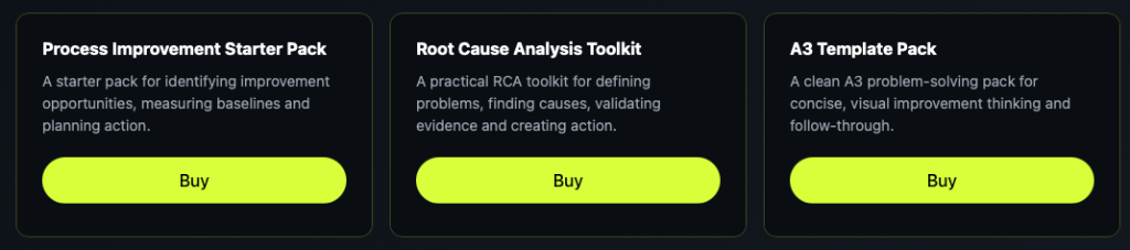
Root Cause Analysis Toolkit
A practical RCA toolkit for defining problems, finding causes, validating evidence and creating action.
A3 Template Pack
A clean A3 problem-solving pack for concise, visual improvement thinking and follow-through.