What is a Control Chart Template?
A control chart is a statistical process control (SPC) tool that plots process data over time with three reference lines: the centre line (process average), the Upper Control Limit (UCL) and the Lower Control Limit (LCL). These limits are calculated from the data itself and define the range of normal process variation.
The control chart distinguishes between two types of variation: common cause variation (normal, expected fluctuation within the control limits) and special cause variation (unusual events outside the limits that indicate something has changed). This distinction prevents the costly mistake of reacting to normal variation as if it were a problem.
Control charts are used in the Measure phase to understand process behaviour, and in the Control phase to monitor sustained improvement.
When to use a Control Chart Template
Use a control chart when you have sufficient time-series data and want to distinguish normal process variation from genuine signals. Use it when:
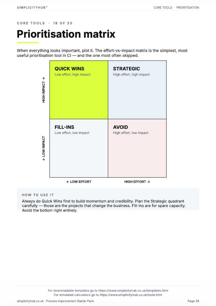
- You want to determine whether a process is stable and predictable before measuring its capability
- You need to identify specific events or periods when the process behaved unusually
- You are monitoring post-improvement performance and want an objective signal if the process regresses
- A sponsor is asking whether a recent change in performance is real or just normal variation
Who should use a Control Chart Template
- Green Belts and Black Belts — as a core Measure phase tool for understanding process stability
- Quality Engineers — for ongoing statistical process control in manufacturing and service
- Operations Managers — to understand whether process performance is genuinely changing
- Black Belts and MBBs — for advanced analysis including process capability studies
Watch: a quick explainer
New to this? This short video walks you through reading a control chart to spot real process problems — a helpful primer before you download and use the template.

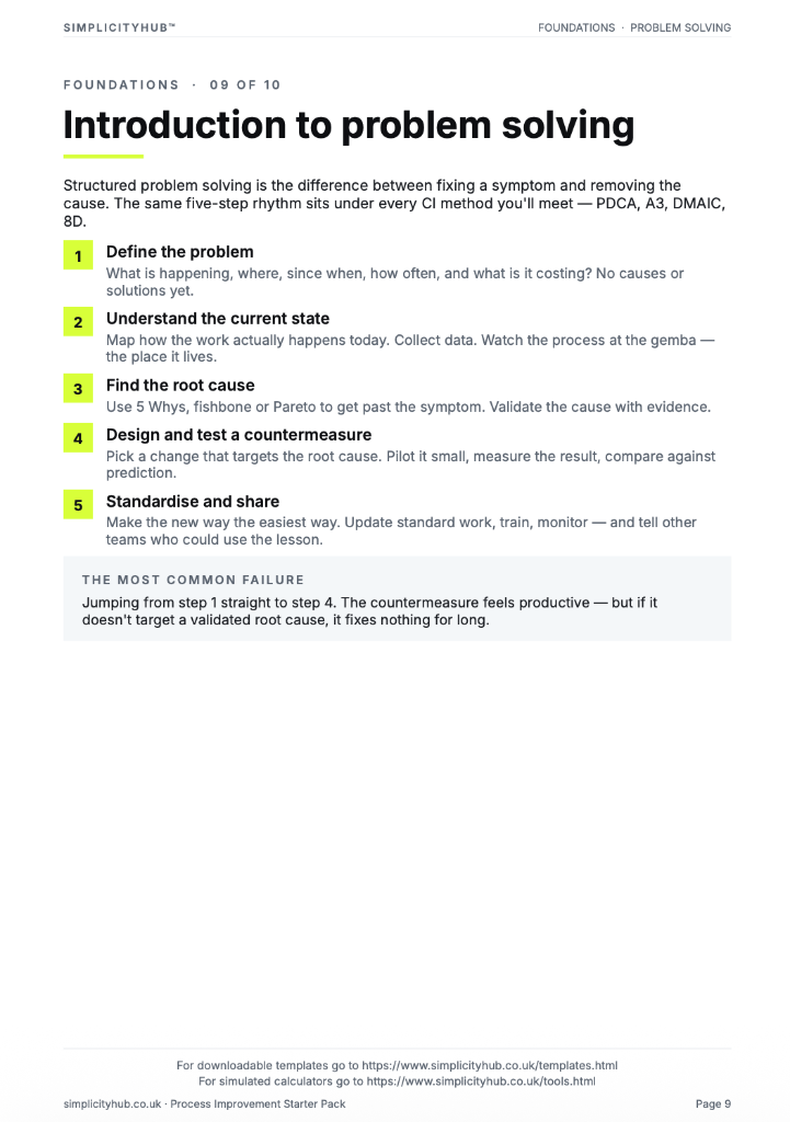
How to build and interpret a Control Chart
Choose the right chart type before you build it — the wrong chart type produces misleading control limits. The choice depends on whether your data is continuous or discrete, and whether you are measuring individual values or subgroup averages.
How to build and interpret a Control Chart — step by step
-
1Choose the right chart type
For continuous data with subgroups (e.g. daily averages): X-bar R chart. For individual continuous measurements: I-MR chart. For proportion defective: p-chart. For defect counts: c-chart or u-chart. Using the wrong type invalidates the limits.
-
2Collect at least 20–25 data points
Control limits calculated from fewer than 20 data points are unreliable. Collect at least 25 subgroups or individual data points before calculating limits.
-
3Calculate the centre line
The centre line is the process average (mean of all data points, or mean of subgroup averages for X-bar charts).
-
4Calculate control limits
UCL = centre line + 3σ. LCL = centre line − 3σ. The standard deviation (σ) is estimated from within-subgroup variation for X-bar charts, or from the moving range for I-MR charts. Do not use the overall standard deviation — it overstates limits.
-
5Plot the data and limits
Plot each data point in time order. Add the centre line and the UCL and LCL as horizontal reference lines. Connect the data points with a line.
-
6Apply the control chart rules
Look for signals: any point outside the control limits (Rule 1); eight consecutive points on one side of the centre line (Rule 2); six consecutive points trending in one direction (Rule 3). Each signal indicates a special cause.
-
7Investigate special causes
For every signal identified, investigate what happened at that point in time. Special causes should be identified, understood and either eliminated (if bad) or built in (if good).
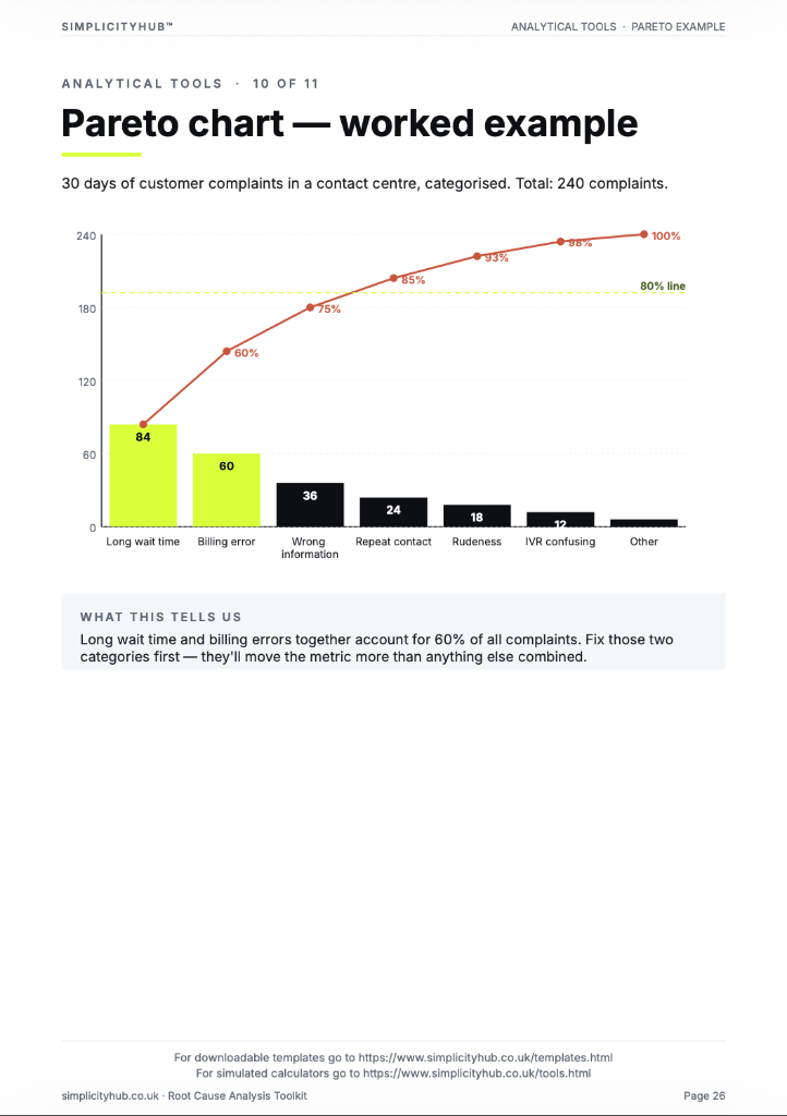
Worked example — Invoice Processing Time SPC Chart
A completed I-MR control chart for invoice processing time, showing UCL, centre line and LCL with a special cause signal identified in week 6 traced to a system outage.
Common mistakes — and how to avoid them
Using the wrong chart type. An I-MR chart applied to attribute data, or a p-chart applied to continuous data, produces meaningless control limits. Select the chart type based on your data type before building.
Recalculating limits every time new data is added. Control limits should be calculated from a stable baseline period and held fixed. Re-calculating limits with every new data point makes the chart adapt to the process rather than monitor it.
Reacting to every point outside the limits. A single point outside the control limits is a signal to investigate — not necessarily to act. Confirm the special cause before making process changes.
Confusing control limits with specification limits. Control limits describe what the process actually does. Specification limits describe what the customer requires. They are different things. A process can be within control limits but outside specification limits.
Tips for getting better results
Use control charts before calculating process capability. Process capability (Cp, Cpk) is only meaningful for a stable process. Run a control chart first to confirm the process is in statistical control before calculating capability.
Add annotation for known events. Mark on the chart when process changes occurred — new equipment, staff changes, procedure updates. This helps explain special causes and makes the chart a process history.
Use control charts in the daily management board. A control chart updated weekly on the team's daily management board gives the process owner an immediate visual signal if performance is shifting — before KPIs are formally reported.
Download the Control Chart Template
A clean, editable Excel template for immediate use — structured, professional and ready to fill in.
Frequently asked questions
Control chart vs run chart?
A run chart plots data without limits. A control chart adds statistically derived upper and lower control limits.
How do I set the control limits?
Calculate from the process data itself — typically plus or minus 3 standard deviations from the mean.
What is a special cause?
Any data point outside the control limits, or a non-random pattern such as 8 consecutive points on one side of the centre line.
How often should I update it?
As frequently as data is available — daily, weekly, or per batch depending on the process.
Advanced Toolkit Packs — available now
Structured, ready-to-use template packs designed for real improvement work. Pick the pack that matches your project and get started straight away.
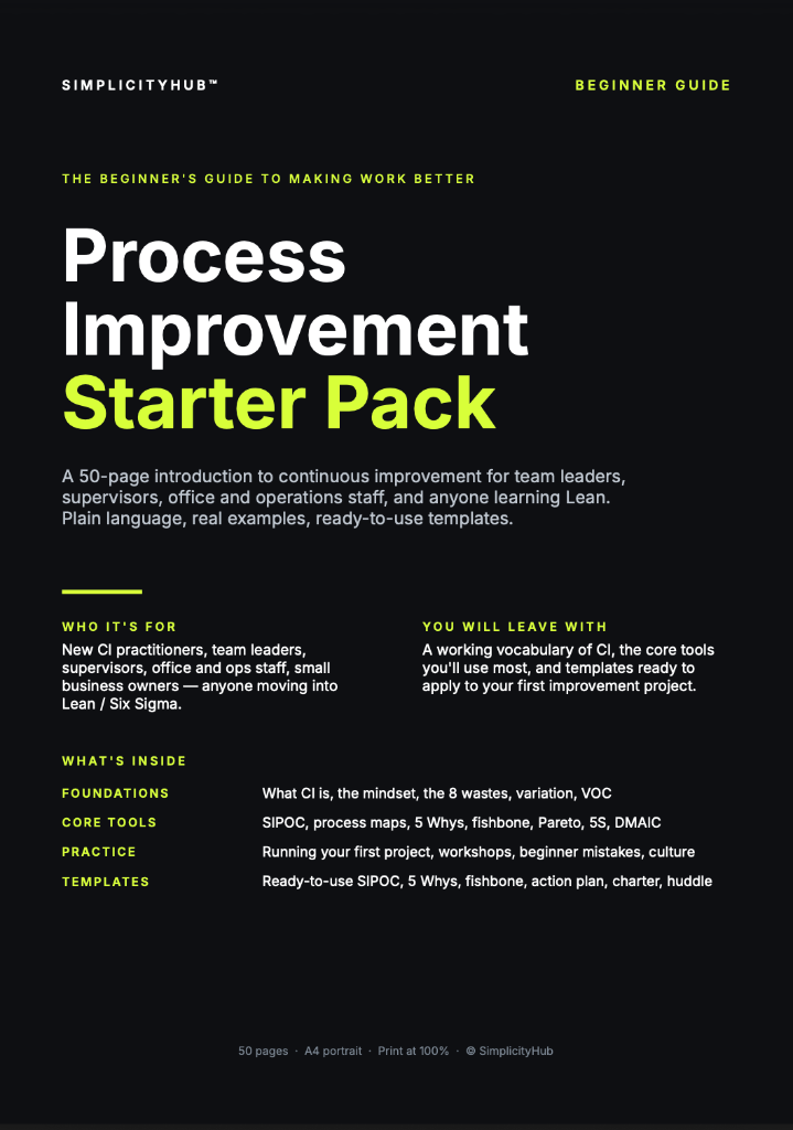
Process Improvement Starter Pack
A starter pack for identifying improvement opportunities, measuring baselines and planning action.
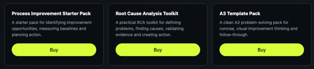
Root Cause Analysis Toolkit
A practical RCA toolkit for defining problems, finding causes, validating evidence and creating action.
A3 Template Pack
A clean A3 problem-solving pack for concise, visual improvement thinking and follow-through.