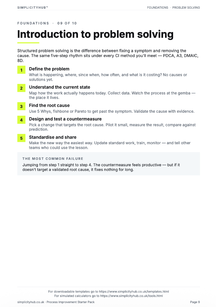
What is a Pareto Chart Template?
A Pareto chart is a bar chart that ranks causes, defect types or problem categories from most to least frequent, with a cumulative percentage line overlaid. It applies the 80/20 rule — the Pareto principle — which states that roughly 80% of problems come from 20% of causes.
The chart makes it immediately clear which causes are the 'vital few' that account for the majority of the problem, and which are the 'trivial many' that, if fixed, would have little impact on overall performance.
Pareto charts are used in the Analyse phase to prioritise which causes to investigate first, and in the Measure phase to understand the distribution of defect or error types before analysis begins.
When to use a Pareto Chart Template
Use a Pareto chart whenever you have data on the frequency or cost of multiple categories of problems and want to identify where to focus. Specifically:
- After collecting defect or complaint data and wanting to identify the most common types
- Before starting root cause analysis, to ensure you are investigating the biggest problem first
- When presenting findings to a sponsor and needing to show where effort should be directed
- To track whether an improvement has changed the distribution of defect types over time
Who should use a Pareto Chart Template
- All belt levels — Pareto analysis is one of the seven basic quality tools and is used at every level
- Quality teams — to analyse defect logs, complaint categories and non-conformance data
- Operations managers — to prioritise where to focus improvement resource
- Green Belts and Black Belts — as part of the Measure and Analyse phase toolkit
Watch: a quick explainer
New to this? This short video walks you through using a Pareto chart to focus on the vital few — a helpful primer before you download and use the template.

How to build a Pareto chart
A Pareto chart starts with good data. Before you build the chart, ensure your defect or problem categories are clearly defined and consistently recorded — otherwise you are ranking noise, not signal.
How to build a Pareto chart — step by step
-
1Collect and categorise your data
Gather frequency or cost data for each category of problem, defect or complaint type. Ensure categories are mutually exclusive — each occurrence should fit into one category only.
-
2Rank categories from highest to lowest
Sort the categories from most frequent (or most costly) to least. The highest bar goes on the left, the lowest on the right.
-
3Calculate cumulative percentages
Add the percentages cumulatively from left to right. The first bar is its own percentage. The second bar adds its percentage to the first. Continue to 100%.
-
4Draw the bar chart and the cumulative line
Plot the bars in ranked order. Overlay the cumulative percentage line on a secondary y-axis scaled from 0% to 100%.
-
5Identify the 80% line
Draw a horizontal line at 80% on the cumulative axis. The bars to the left of where this line meets the cumulative curve are the 'vital few' — your priority targets.
-
6Document the insight
Write a one-sentence finding: 'The top two defect types account for X% of all defects. Fixing these would eliminate the majority of the problem.' This is what you present to the sponsor.
-
7Stratify if needed
If the 'Other' category is large, drill into it with a second Pareto chart. Multiple layers of Pareto analysis can reveal hidden patterns within a catch-all category.
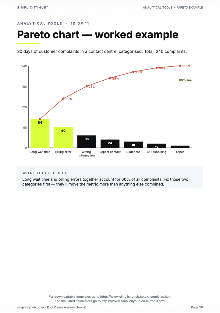
Worked example — Customer Complaints by Type
A completed Pareto chart for customer complaint types, showing that late delivery and wrong items account for 73% of all complaints — the clear priority for root cause analysis.
Common mistakes — and how to avoid them
Using a Pareto for continuous data. Pareto charts are for discrete categories — defect types, complaint categories, error codes. Do not use them for continuous measurements like weight, temperature or time. Use a histogram instead.
Having an 'Other' category that dominates. If 'Other' is the tallest bar, your categories are too narrow. Reclassify the data into broader, more meaningful groups that give the analysis direction.
Acting on the chart without validation. A Pareto tells you what is most frequent — it does not tell you what is most important to fix, or what the root cause is. Use it to prioritise, then validate with root cause analysis.
Not labelling the axes clearly. A chart without clear axis labels, category names and a sample size note is unusable in a project review. Always include what the data represents, the time period and the total n.
Tips for getting better results
Use cost data, not just count data, where possible. Fixing the most frequent defect may not give the biggest saving if that defect is cheap to resolve. Weighting by cost often changes the priority ranking.
Run a Pareto before and after the improvement. Comparing pre- and post-improvement Pareto charts in a project closure report is a powerful way to demonstrate what has changed.
Stratify by shift, line or team. If the overall Pareto does not give clear direction, split the data by shift, machine, team or time period. The pattern may be concentrated in one area.
Download the Pareto Chart Template
A clean, editable Excel template for immediate use — structured, professional and ready to fill in.
Frequently asked questions
What is the Pareto principle?
Roughly 80% of effects come from 20% of causes. Focus improvement effort on the vital few.
How do I build a Pareto chart?
Count each category, sort descending, plot as bars, and overlay a cumulative percentage line.
What if my data does not follow 80/20?
It does not have to. The Pareto is a prioritisation tool showing relative magnitude.
How often should it be refreshed?
After any significant process change — the Pareto shifts and you need to re-prioritise.
Advanced Toolkit Packs — available now
Structured, ready-to-use template packs designed for real improvement work. Pick the pack that matches your project and get started straight away.
Process Improvement Starter Pack
A starter pack for identifying improvement opportunities, measuring baselines and planning action.


Root Cause Analysis Toolkit
A practical RCA toolkit for defining problems, finding causes, validating evidence and creating action.
A3 Template Pack
A clean A3 problem-solving pack for concise, visual improvement thinking and follow-through.